<— BACK TO OFFICE TALKS
Aleksey Lukyanov-Cherny: Designing Space for a Digital World
Published Nov. 2018
Aleksey Lukyanov-Cherny, Founding Partner of SITU shares how his firm uses data to inform what people need from space. He sheds light on the surprising outcomes his team uncovers as they learn about how people use the spaces they create.
SHARE VIDEO:
VIDEO TRANSCRIPT
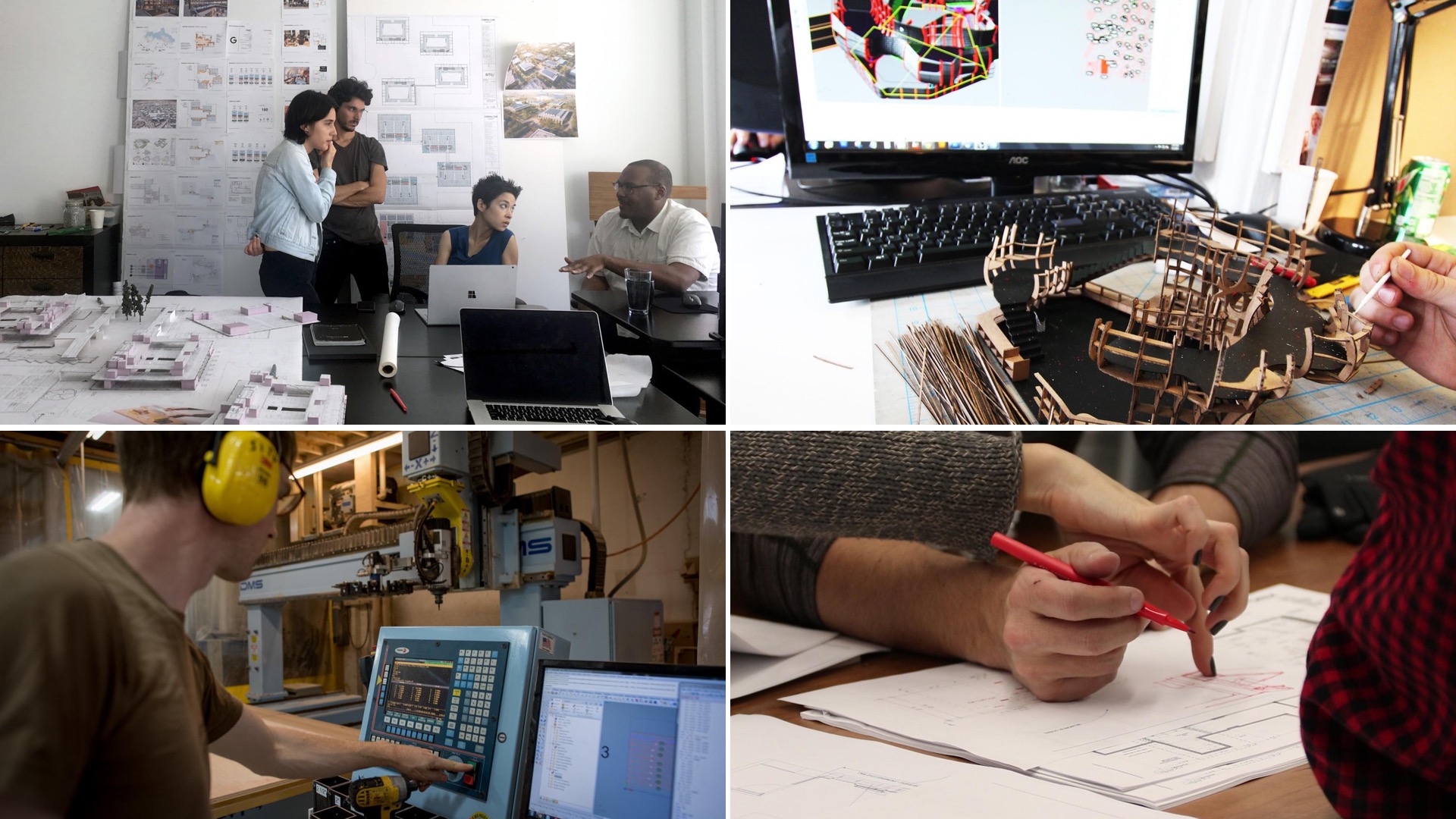
My name is Aleksey Lukyanov-Cherny, I’m one of the founding partners of SITU. An unconventional architecture practice based in Brooklyn New York and we have three divisions a research division, a design group and a fabrication group. I would like to say that we use these different talents these different groups all in effort to create a social and creative impact.
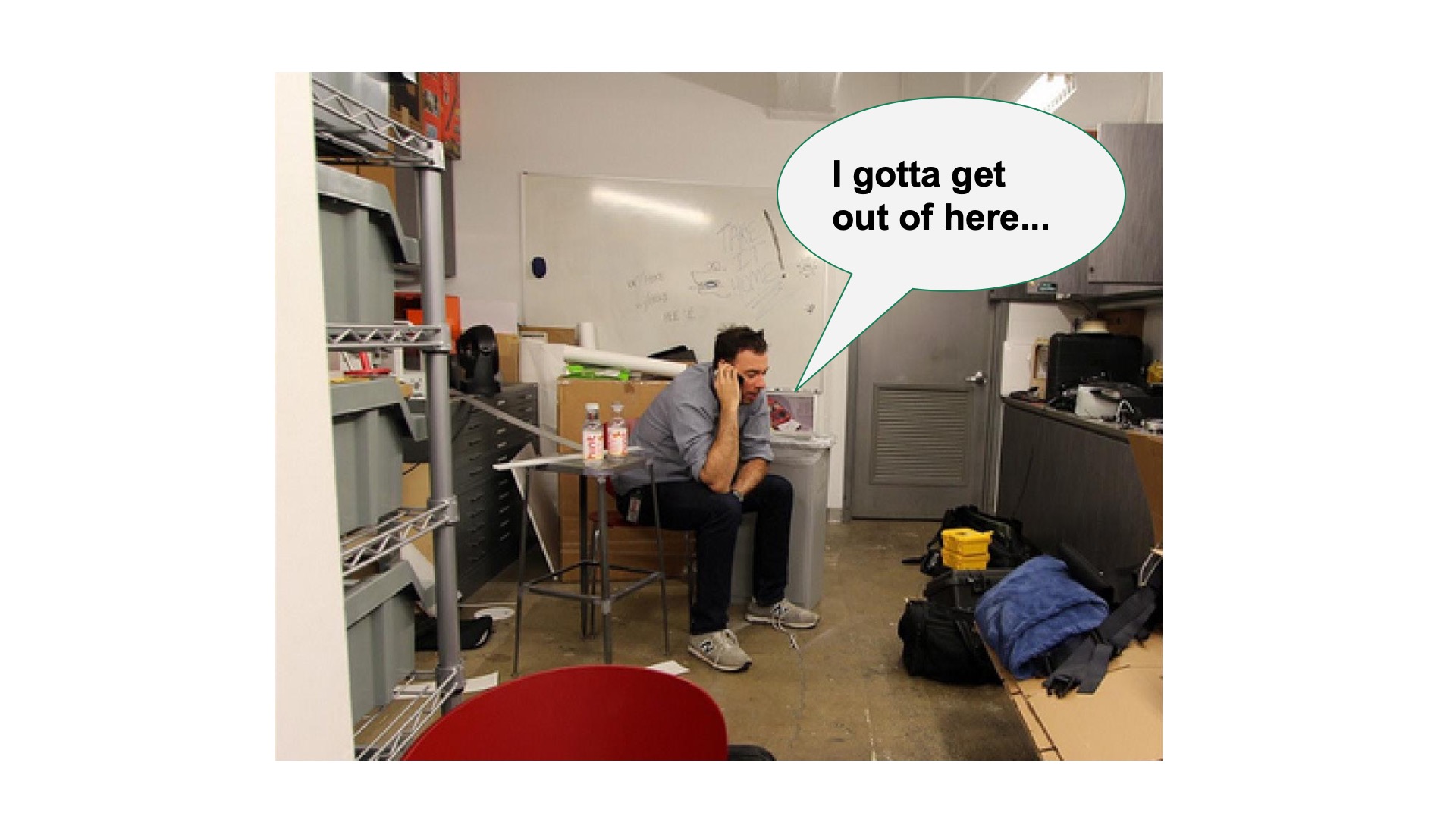
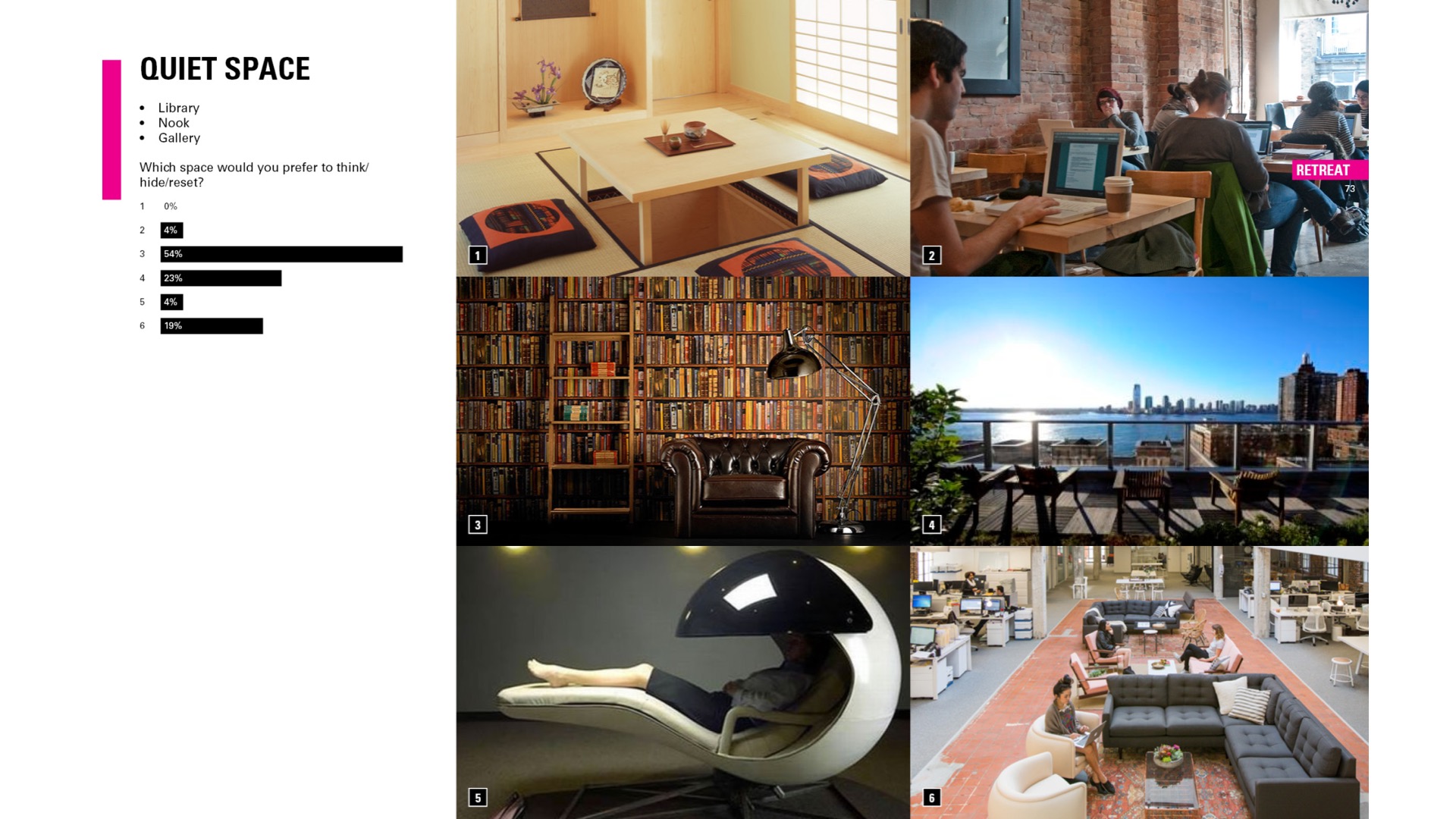
Over the last 13 years we've been lucky and fortunate to work with a number of innovative companies out there across different fields and sectors. Today I'm going to share three projects and three topics that we've been sort of uncovering over the last few years. Alternative spaces, you know sometimes call them amenities spaces but amenities and maybe a little bit too limiting in this space because the types of programming we're thinking go beyond your typical amenities. So this is an example of alternative space although not designed for use but it's it's actually a photograph one of a number of these types of situations we've documented while embedded in a company's office for a few weeks observing how and where people work and so that this gentleman was taking a private call in what looks like a walk in closet. Weave through surveys and conversations and interviews. We came across some interesting discoveries in terms of what kind of places people would want to have access to at their workplace to have some semblance of a work life balance. Now quick results on the top left corner. So most people do not wish to spend their time in the pod and maybe not on tatami mats, but spaces like libraries and outdoor spaces, cafes and lounges are all seeming to be popular in terms of where people would like to have some personal time at during work hours and given the work hours are just increasing more and more with access to our computers, cell phones etc. etc.. Another interesting moment that we caught was the ideal space people imagine working at and that's the results are on the top left corner.
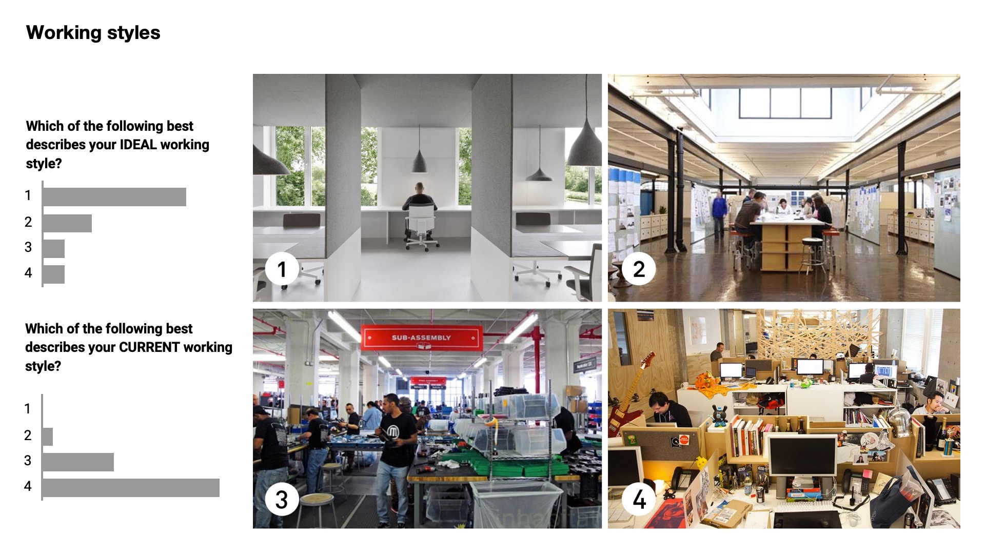
So number one people mostly describe these the responses were clean, serene quiet, calm, well lit, naturally lit. And then when we asked how they feel or what they feel about the spaces where they are working now and most people who responded to number three and four, a subassembly line on one hand or a really cluttered claustrophobic space on the other.
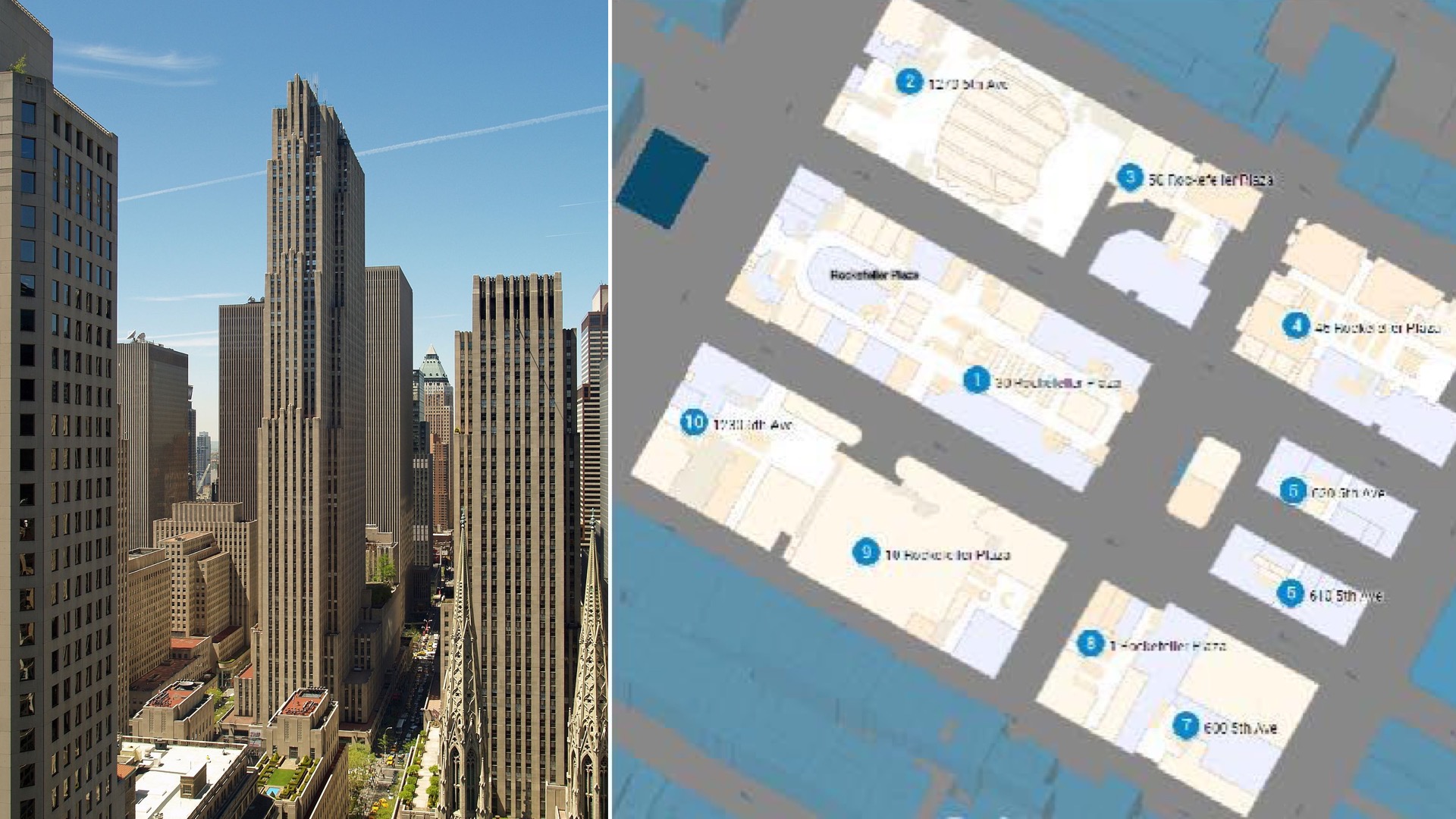
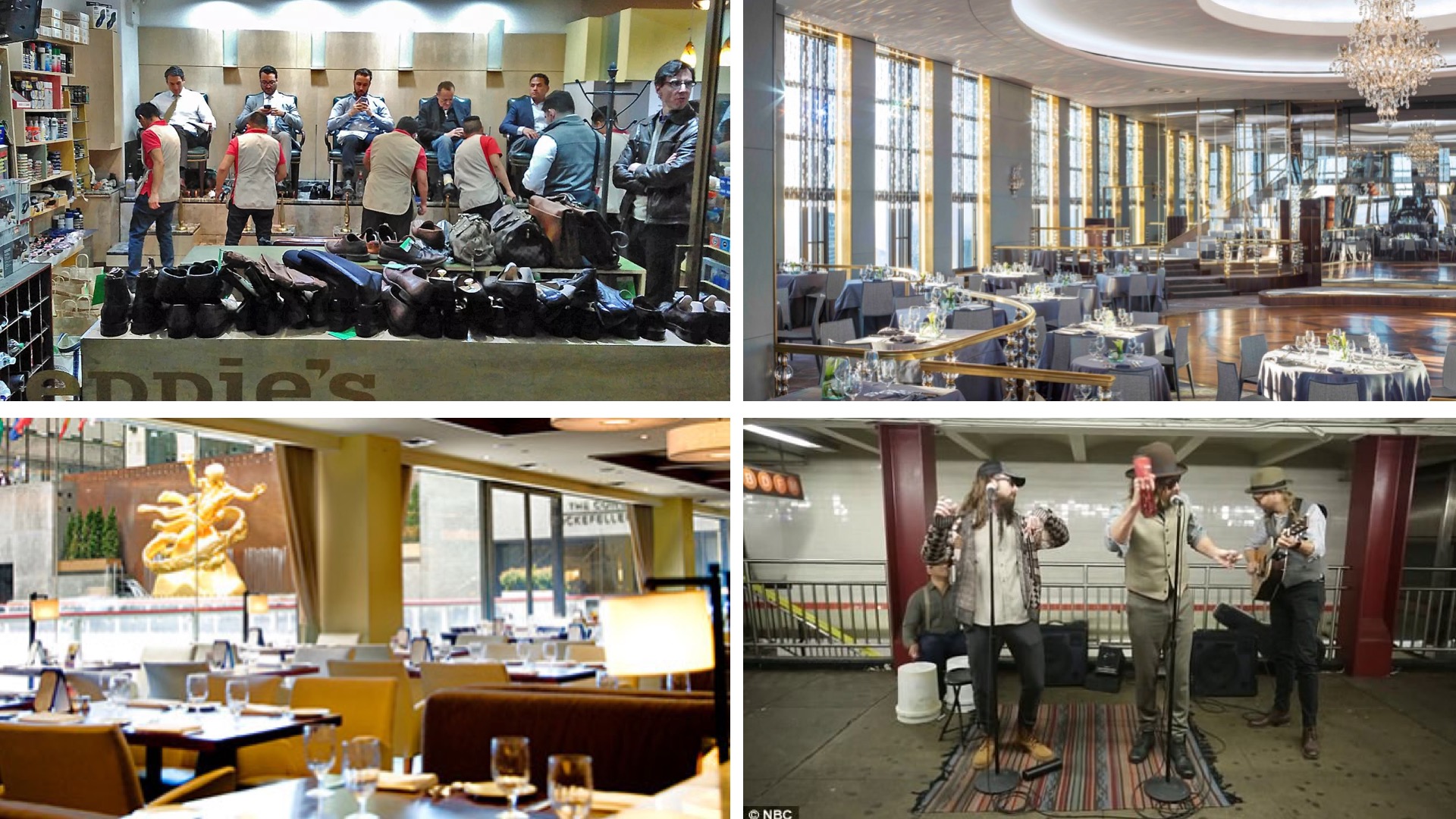
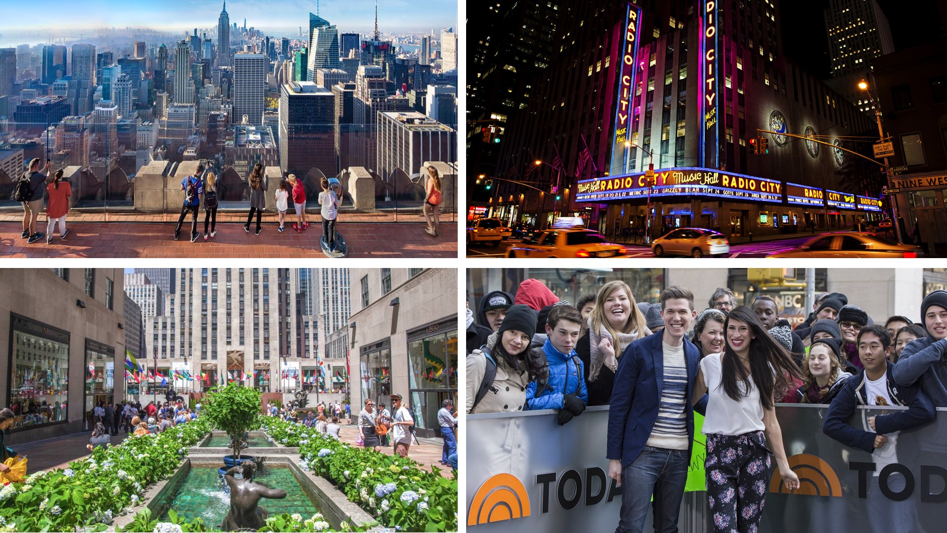
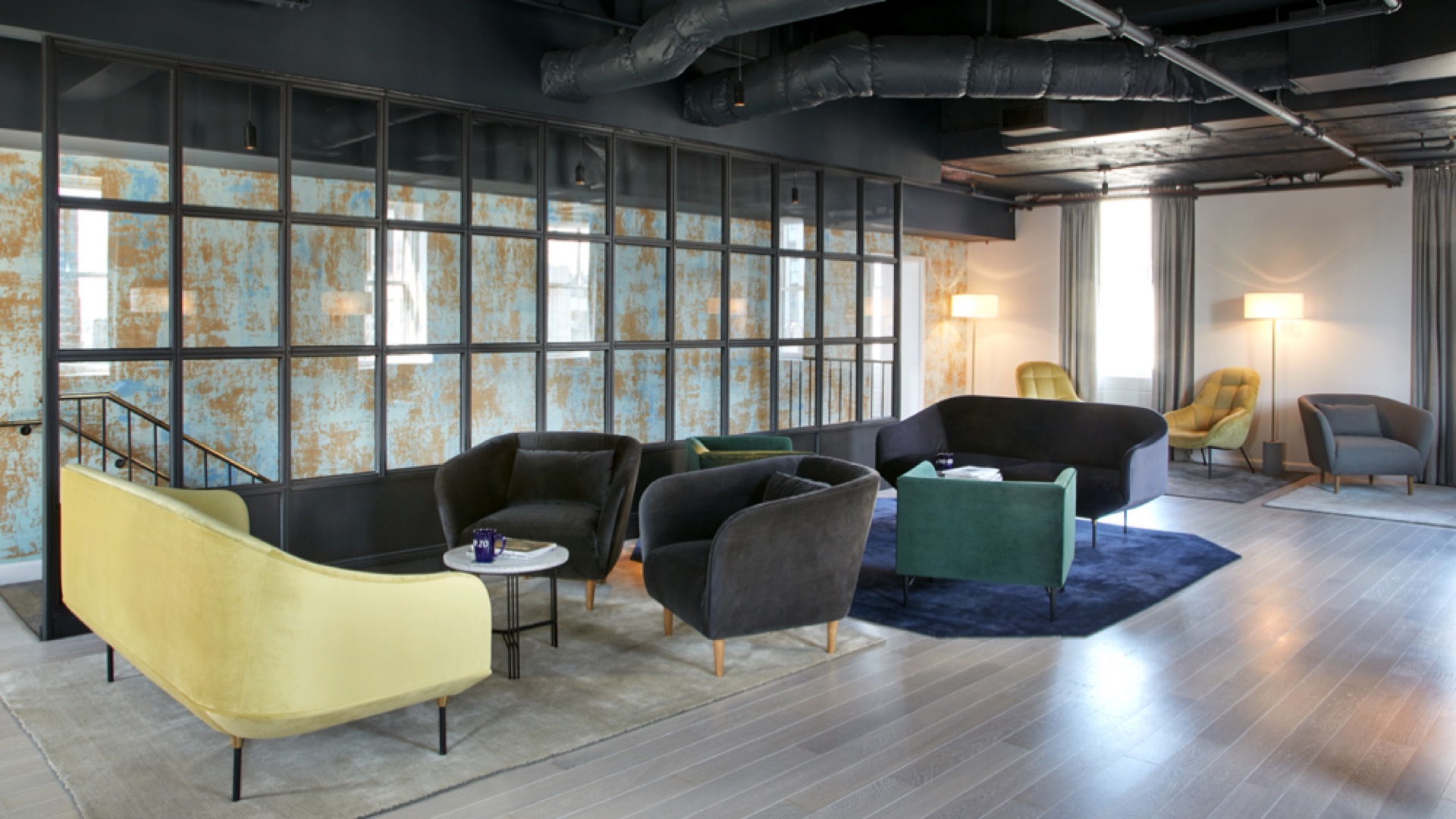
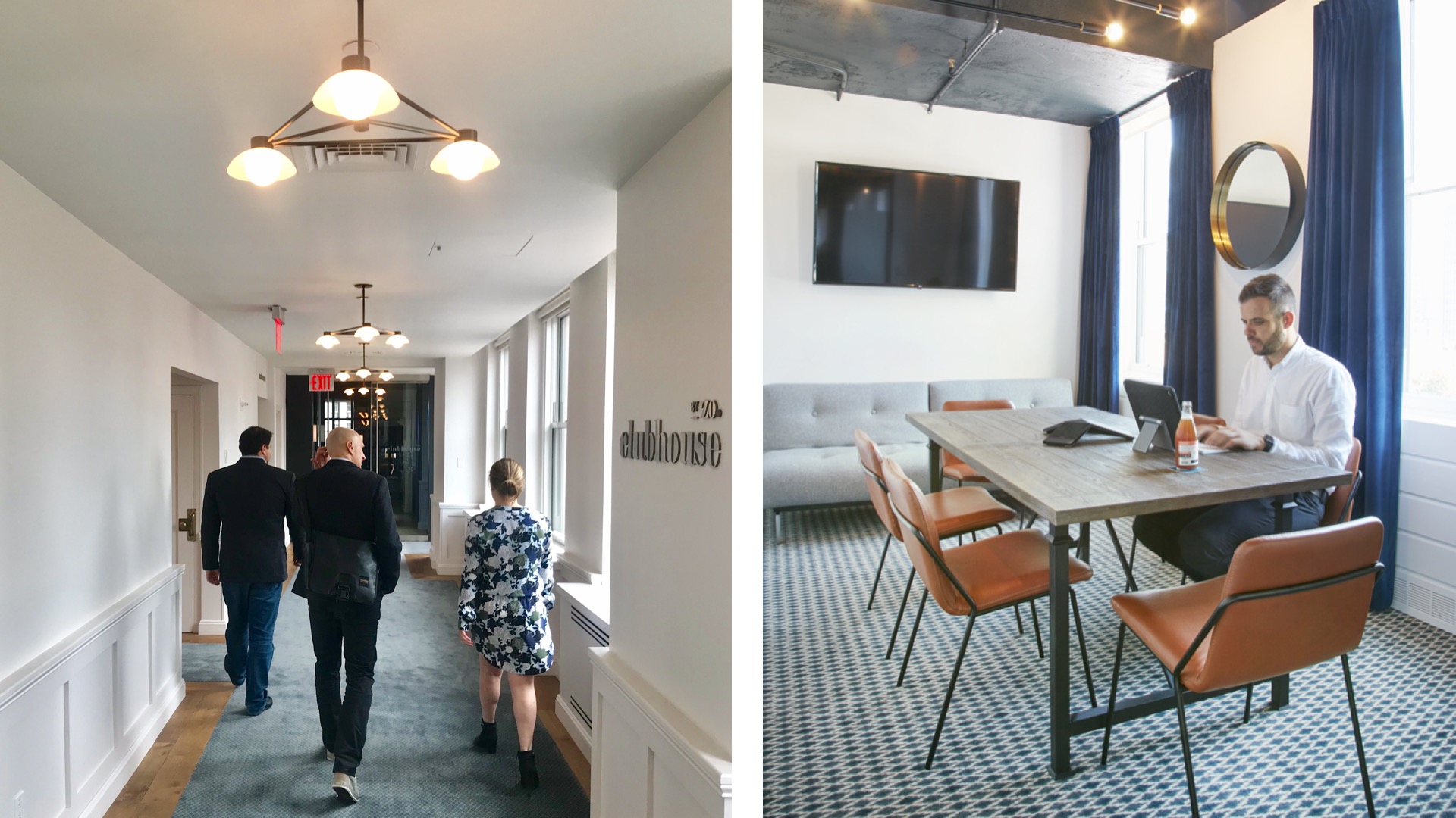
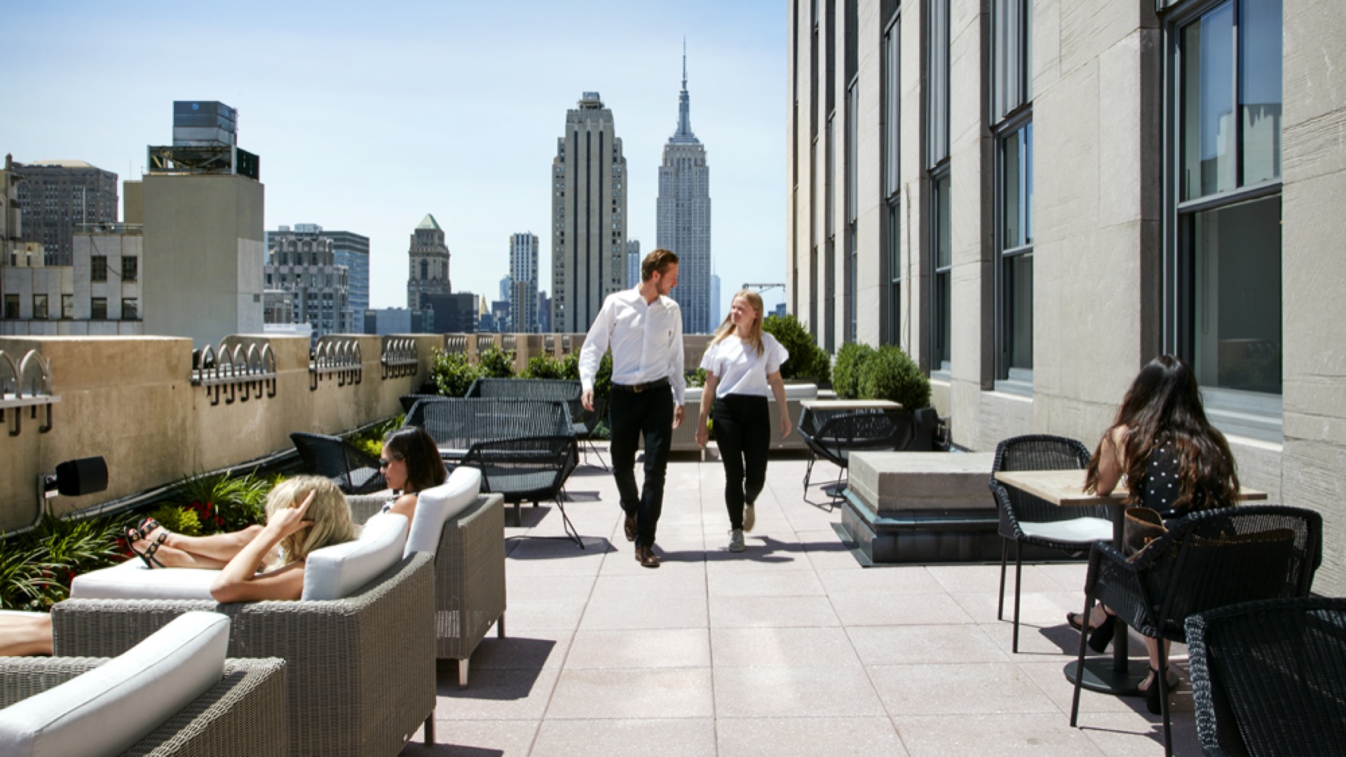
So the first project I'll talk about ha recently opened. It's something we've worked on for a big developer and owner, Tishman Spierer in New York City. It's a project called Zo Clubhouse. Now Rockefeller Center is one of the greatest urban developments I think of all times back in its day and still is now. I believe it's something like 19 buildings sitting across 22 acres of land and the amount of amenities that this complex provides is amazing. From shoe shines and dry cleaners to restaurants and an amazing connection to transportation, music studios, concert halls, obviously a lot of public spaces which is again, as an urban project really amazing. But we also have to understand that tens of thousands of people work in this development as well and so that the kind of the people that come to visit and sightsee and the people that work in these buildings above ground level, are competing for a lot of the spaces and the amenities specifically food and transportation. But some of the other spaces too spaces of retreat.
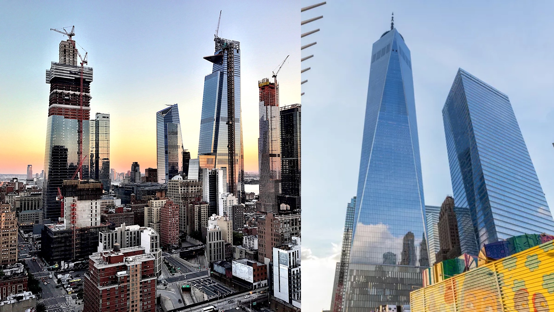
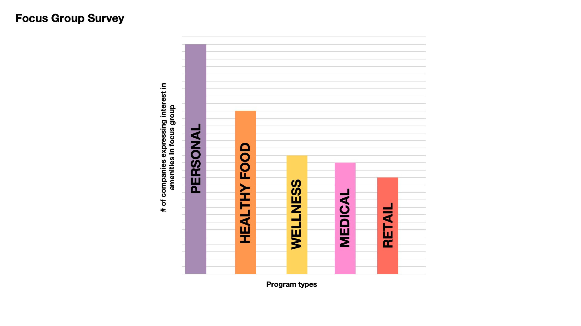
We also know that in the last 10 years there's been a lot of development in New York City building much larger plate buildings, modern buildings, technologically integrated with a lot of empty spaces already provided within those developments and so creating a lot of competition to landlords that are sitting on old stock real estate. Faced with this dilemma, the client here a lot of serving of their tenants, and there's over 300 different tenants in the Rockville Center complex, to understand what type of spaces people would really want to have access to in order to be happy where they are not to leave and pick up their offices to Midtown or World Trade Center area. And so overall it's obviously there's a larger theme of these responses but note that personal spaces are spaces where people can have a personal phone call to arrange for a doctor or a babysitter to meditate to do something else that may be allowed to take care of their life during work hours. It was the biggest response followed by healthy food and wellness spaces.
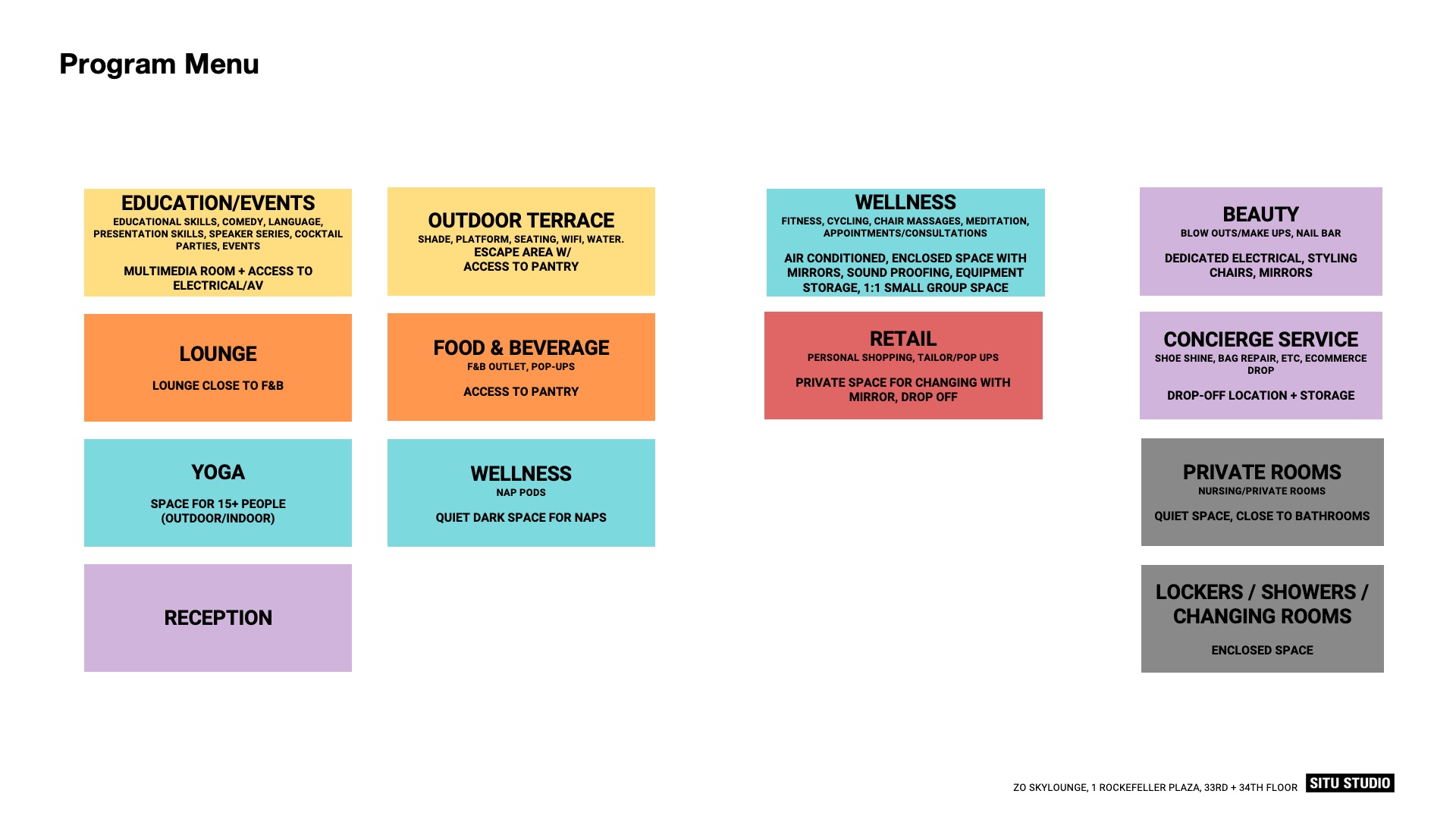
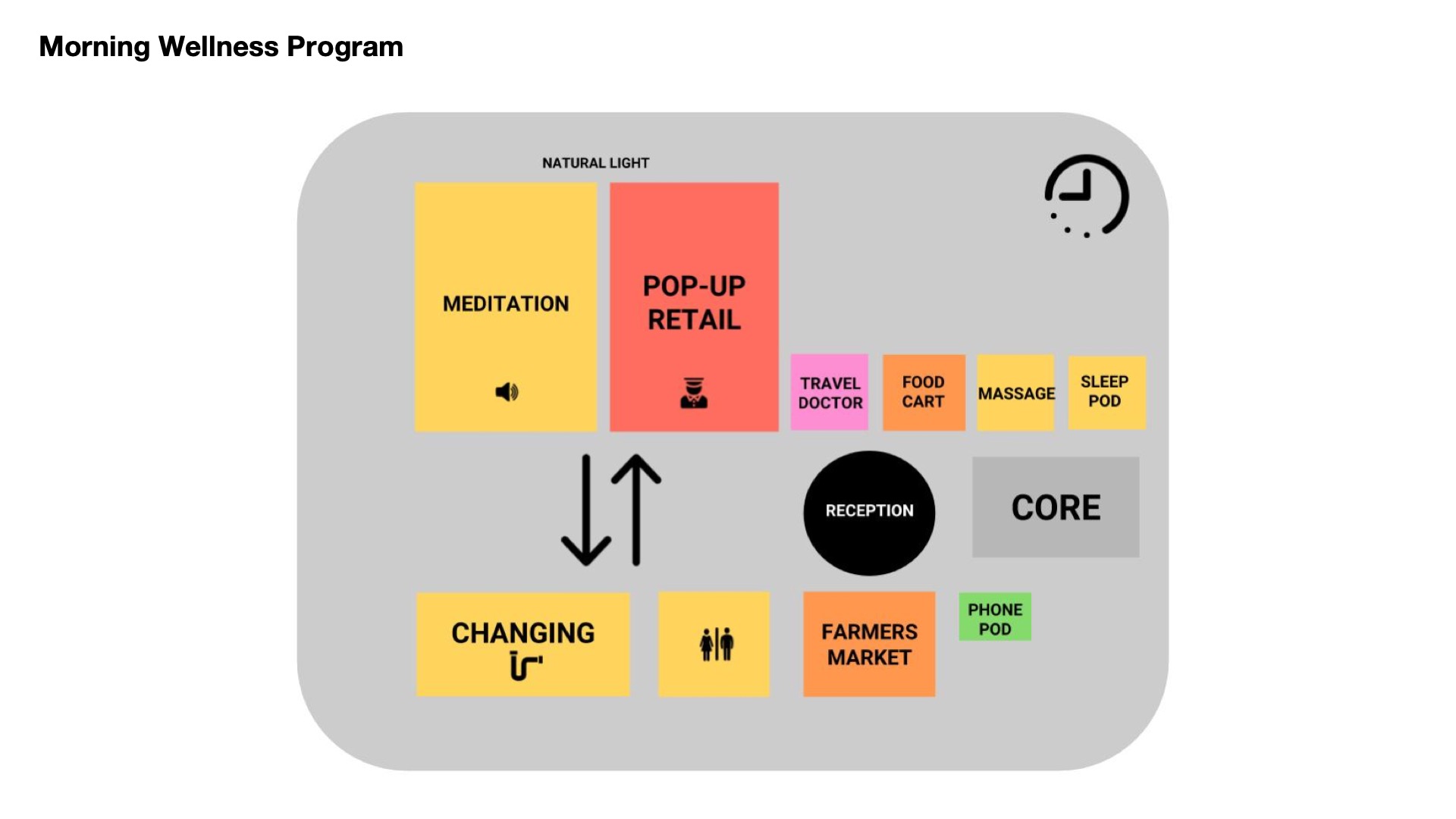
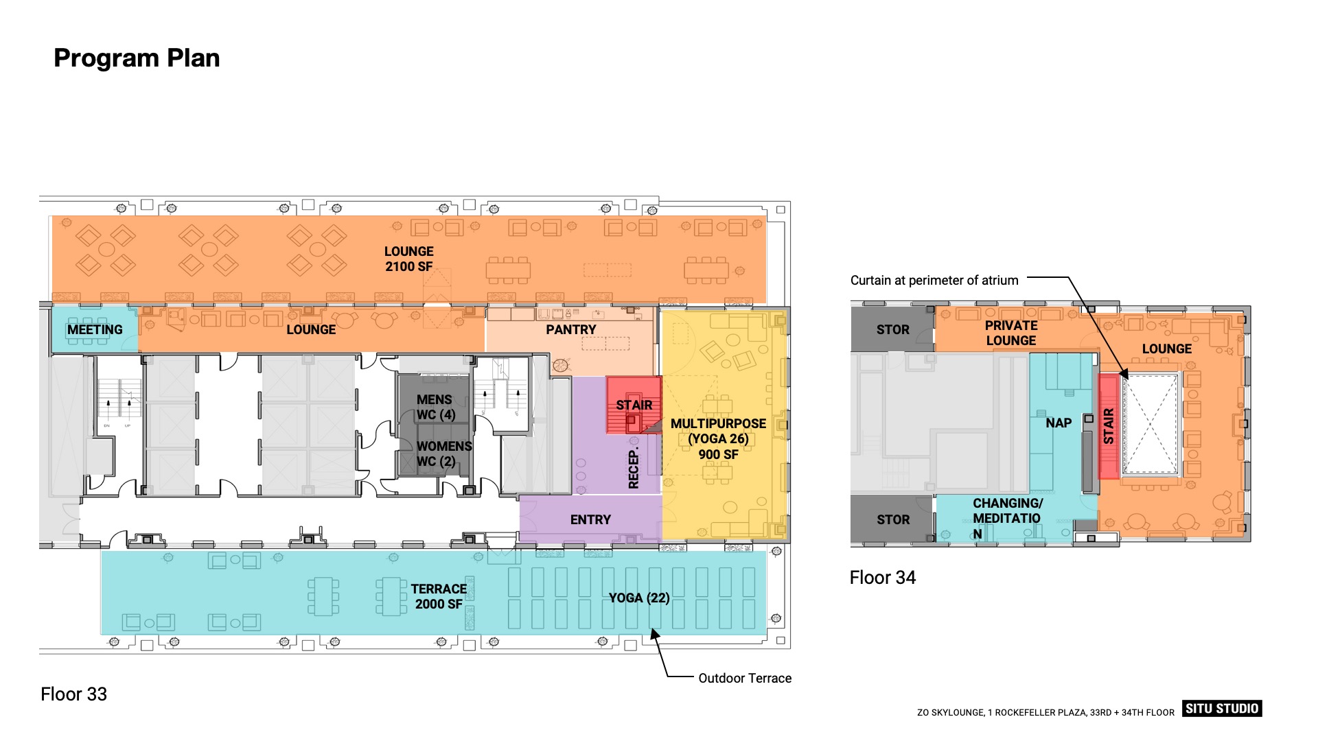
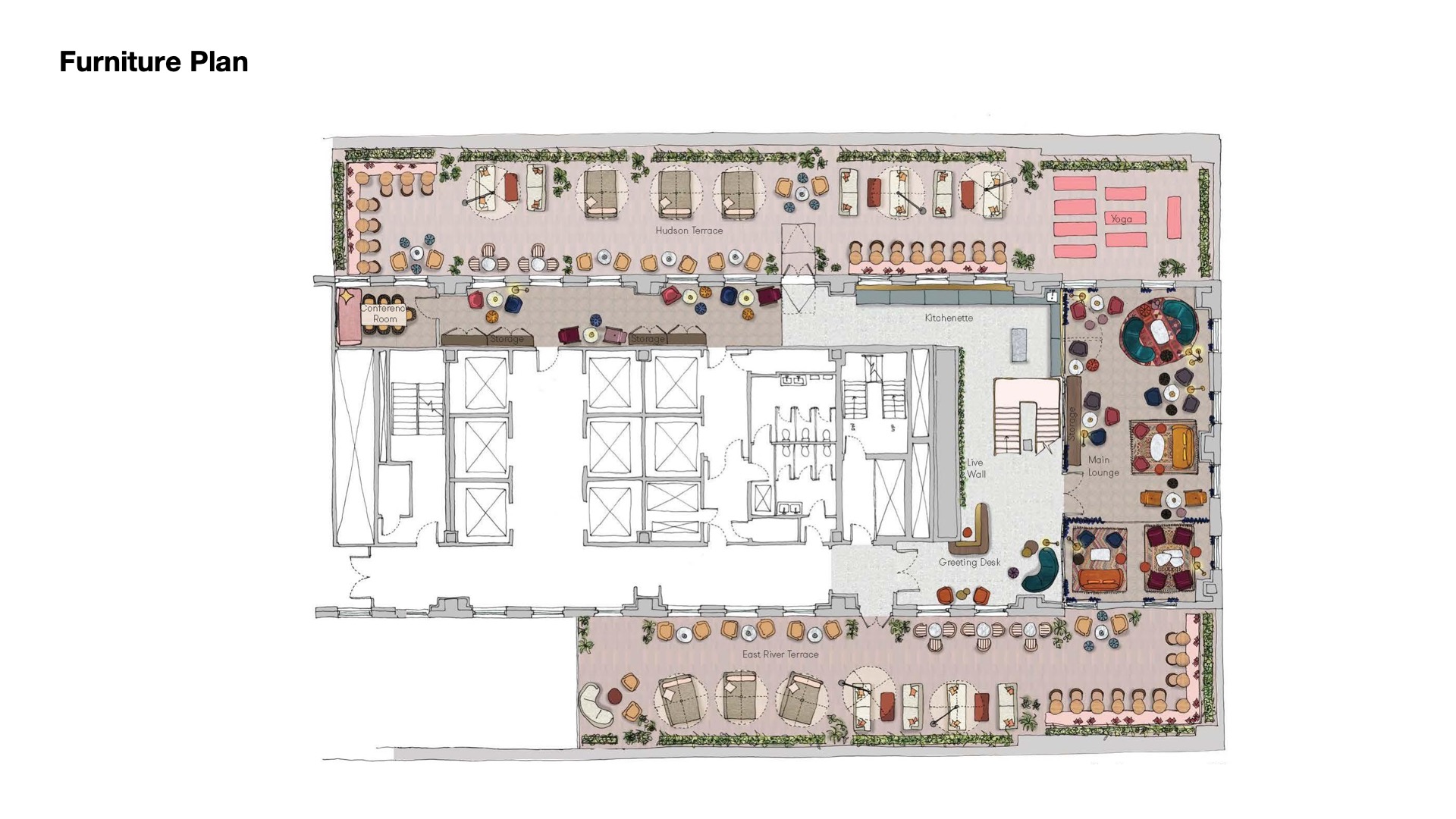
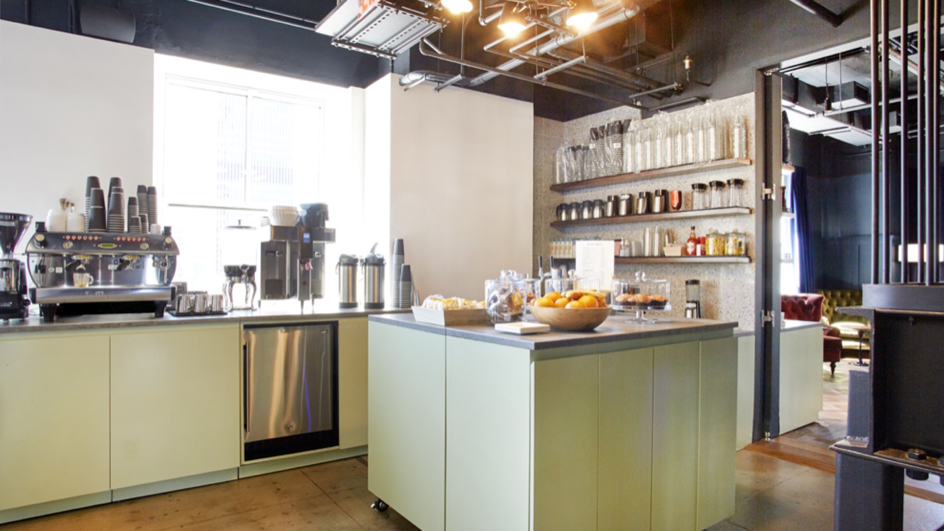
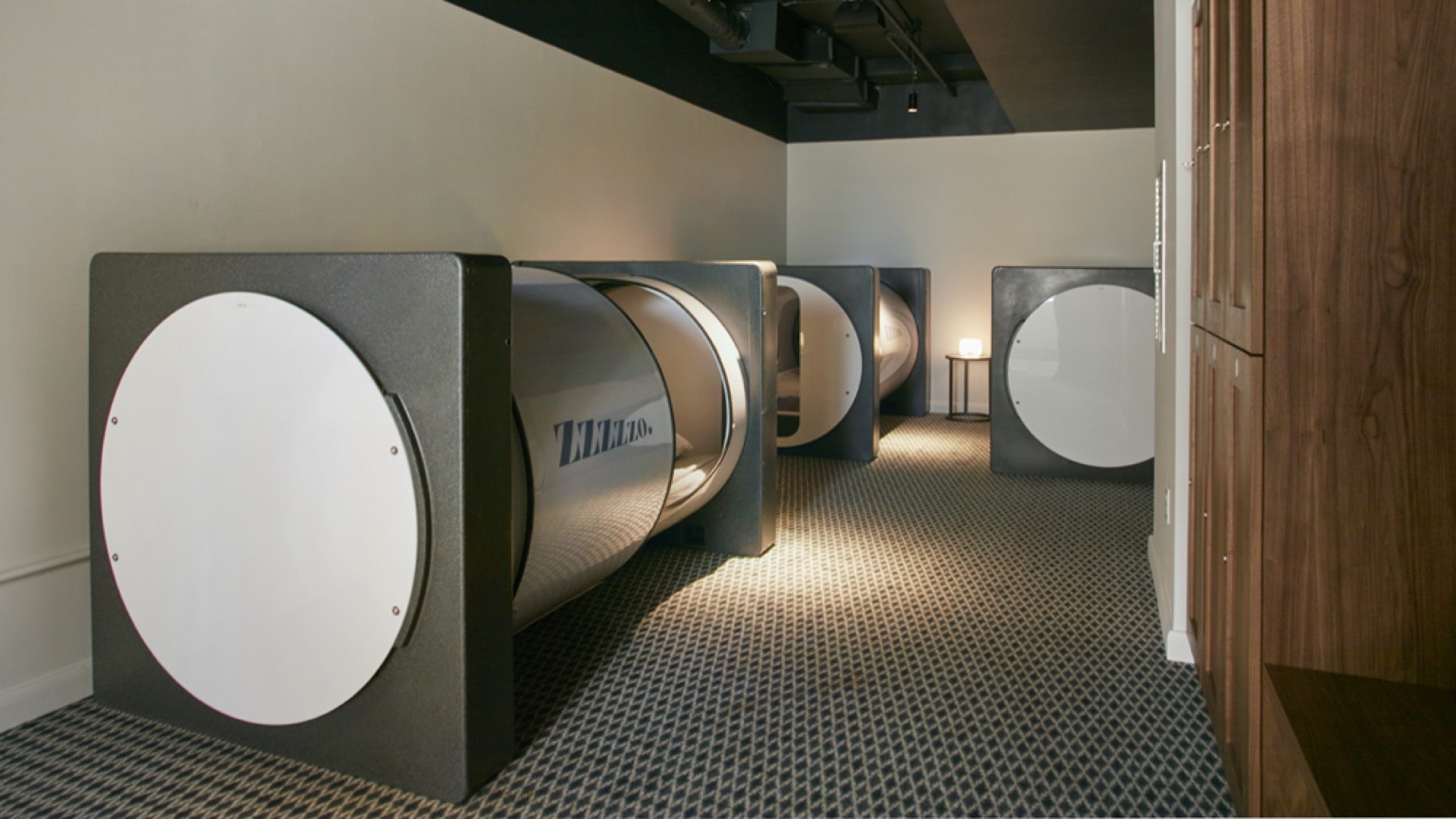
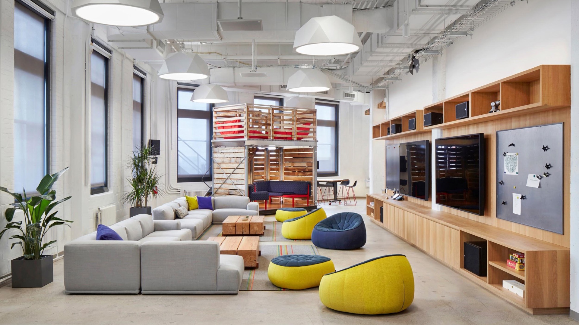
At the beginning of this project, the concept phase, we looked at these types of programming what they mean to spaces and their qualities. We started creating these program mixes understanding what type of programs can work together at different periods of the day. So in the morning maybe there's a wellness program and then throughout the day those spaces can convert to support other type of learning environments or social environments, getaway spaces etc.. After studying probably half a dozen different locations across different rock buildings we settled on one rock to kind of try to launch this pilot project. Now as you can see by the furniture plan there's a lot of soft and social type spaces. And these are some of the early photographs right before the space opens. Not too many people using them. But we've been there recently and it's been a bit of a different scene. But as you can see by the quality of the space it's very much about providing light providing softness providing a very consciously environment to your typical work desk workspace. There's catered kitchen that supports kind of daily visitors but also larger events tournaments partnering with multiple partners for health, fitness for beauty that come in and provide services in these different rooms there's massage rooms and nap rooms. There is definitely an outdoor space was a big attraction and mentioning that rooms there is for nap pods and they are constantly booked throughout the day every single one of the most popular spaces within the within the project.
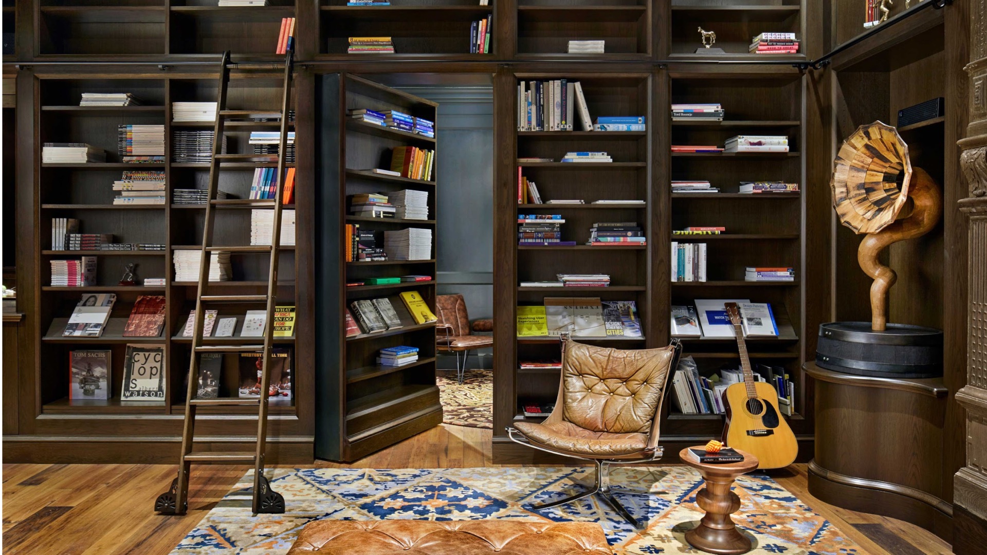
Now this is this is a totally different project space but what I'm trying to point it is it's a different project but the similar take on providing alternative spaces within the workplace. And it's a library space that then has this kind of hidden bookshelf door that leads to a small room without any technology with a computer with a couple of soft seatings, a couch and one of the most shocking I guess revelations we've had from serving from doing a post I can see on that particular project is that having the access to these remote locations and very private location in this instance, allowed people to actually do those kind of intimate moments and they're specifically crying so people during work hours when they're stressed out you know no doubt accelerated by the speed of technology and how much it makes us work and our hours and intensity of things people go in there multiple times different people go in and actually cry in this room.
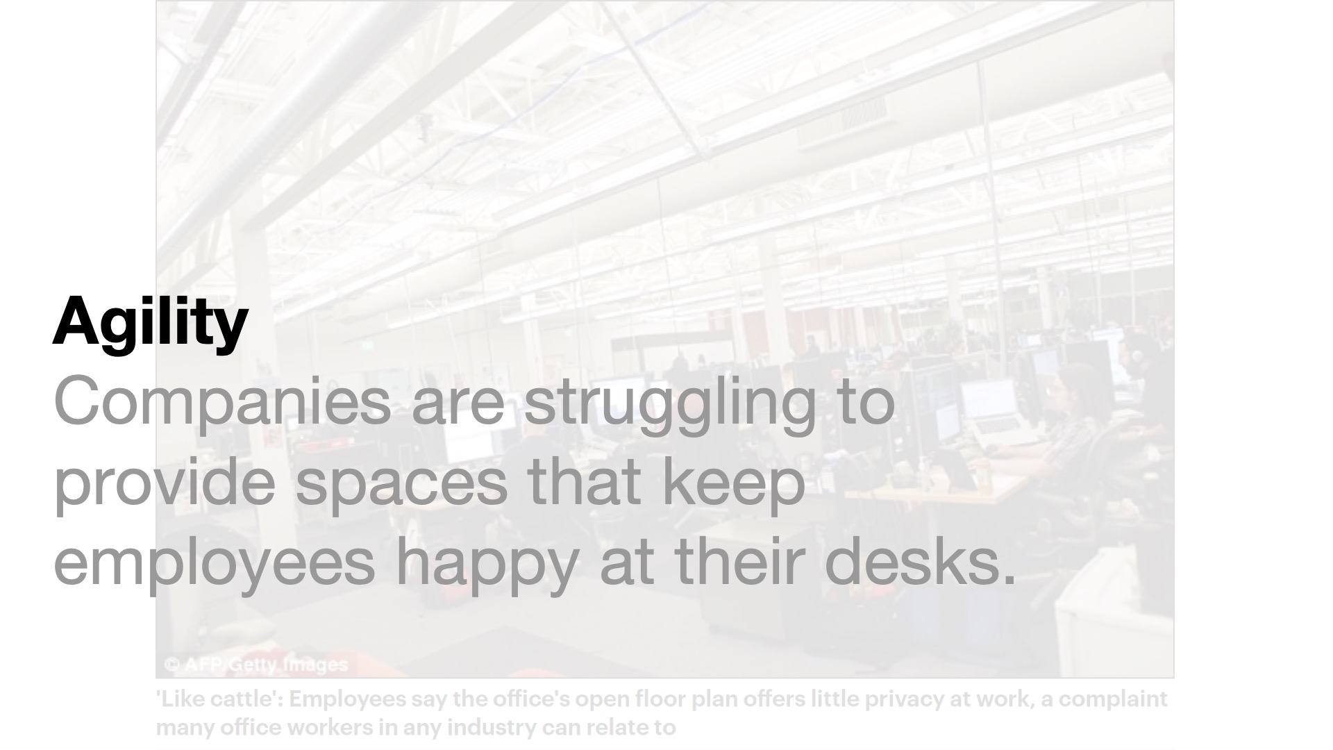
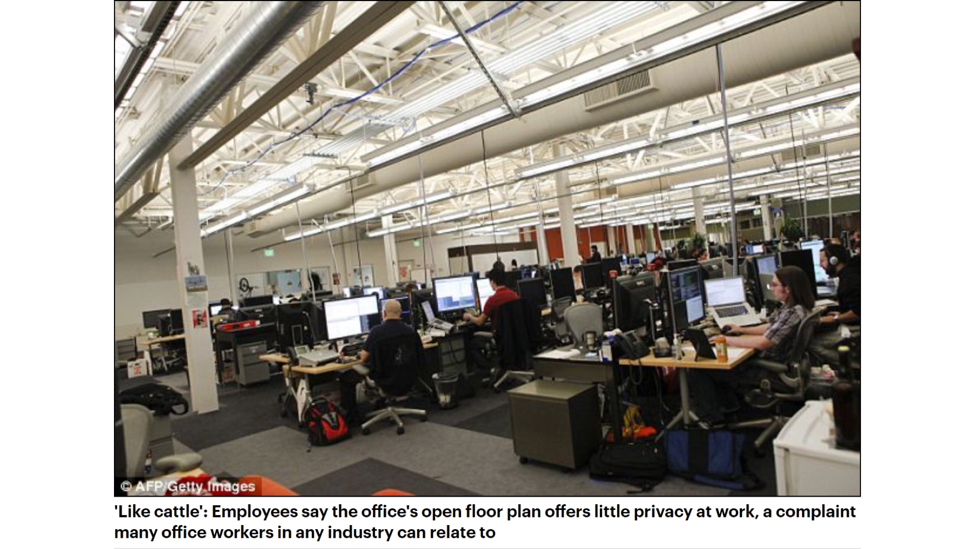
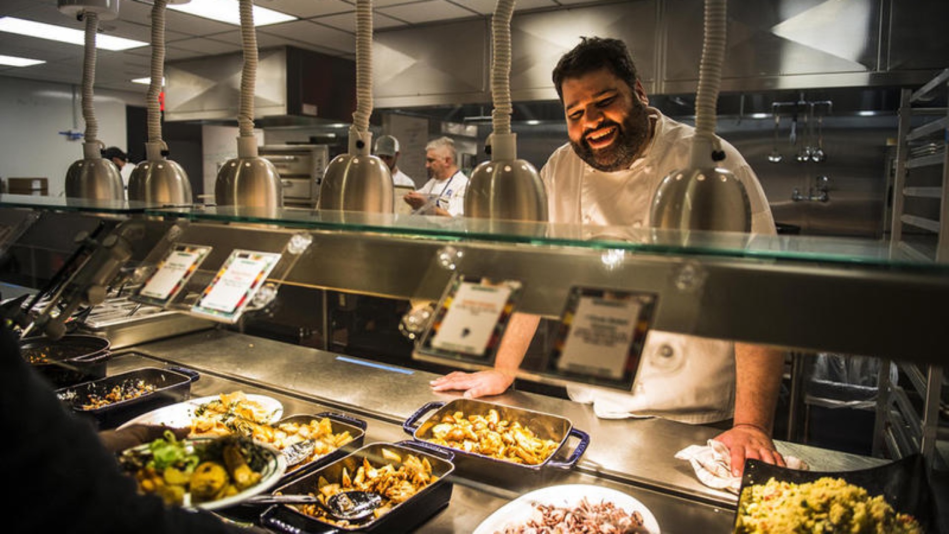
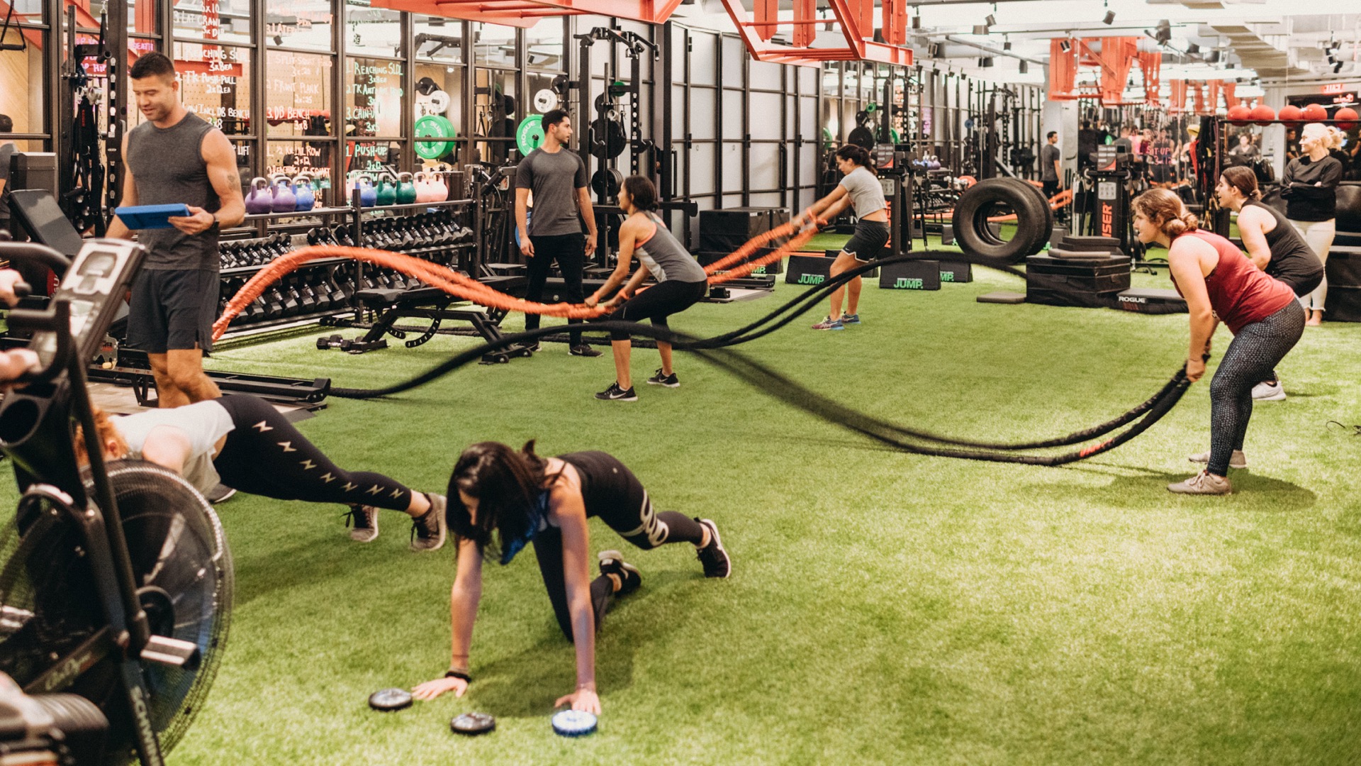
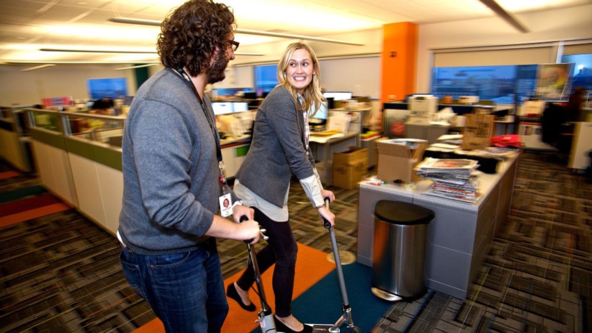
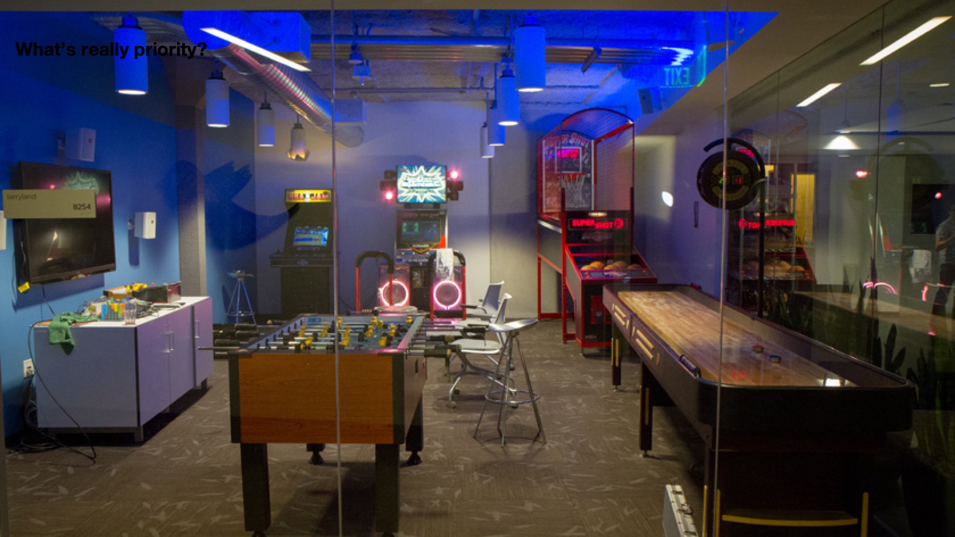
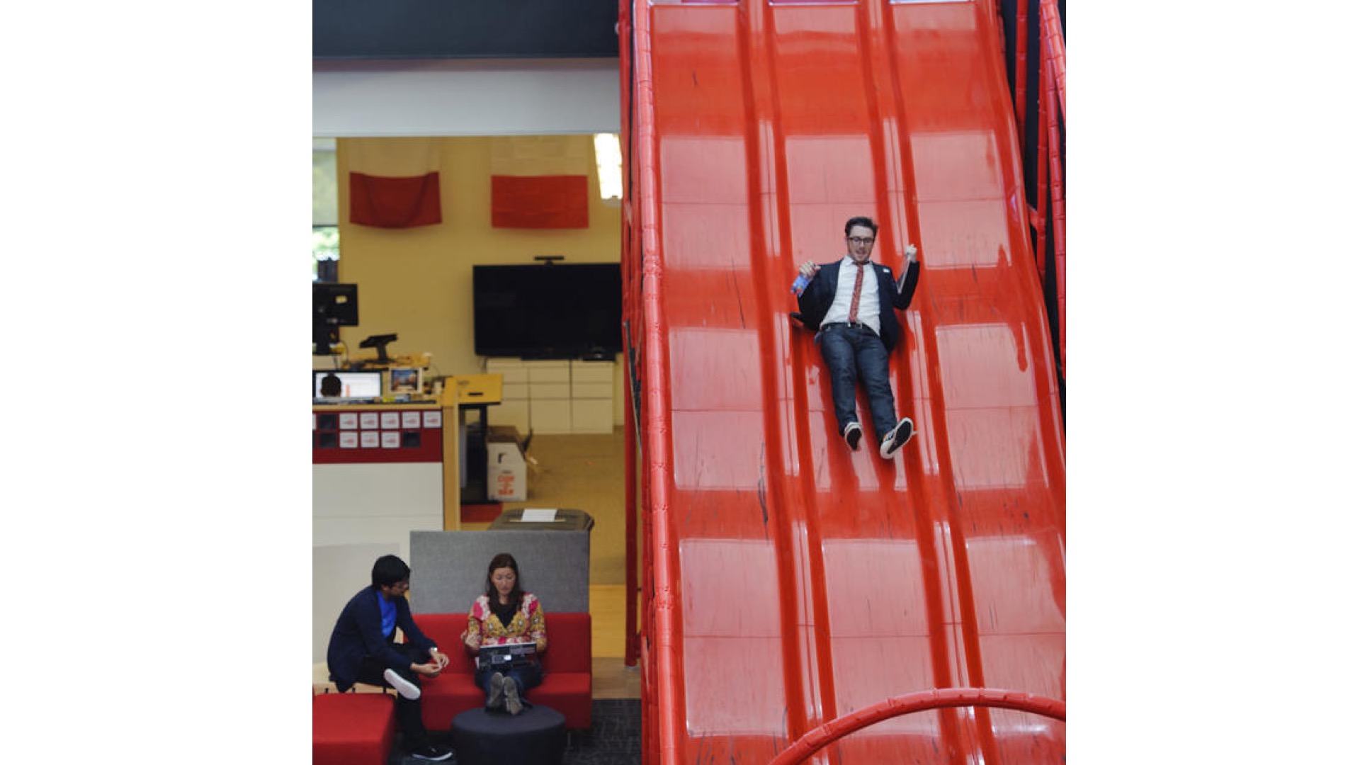
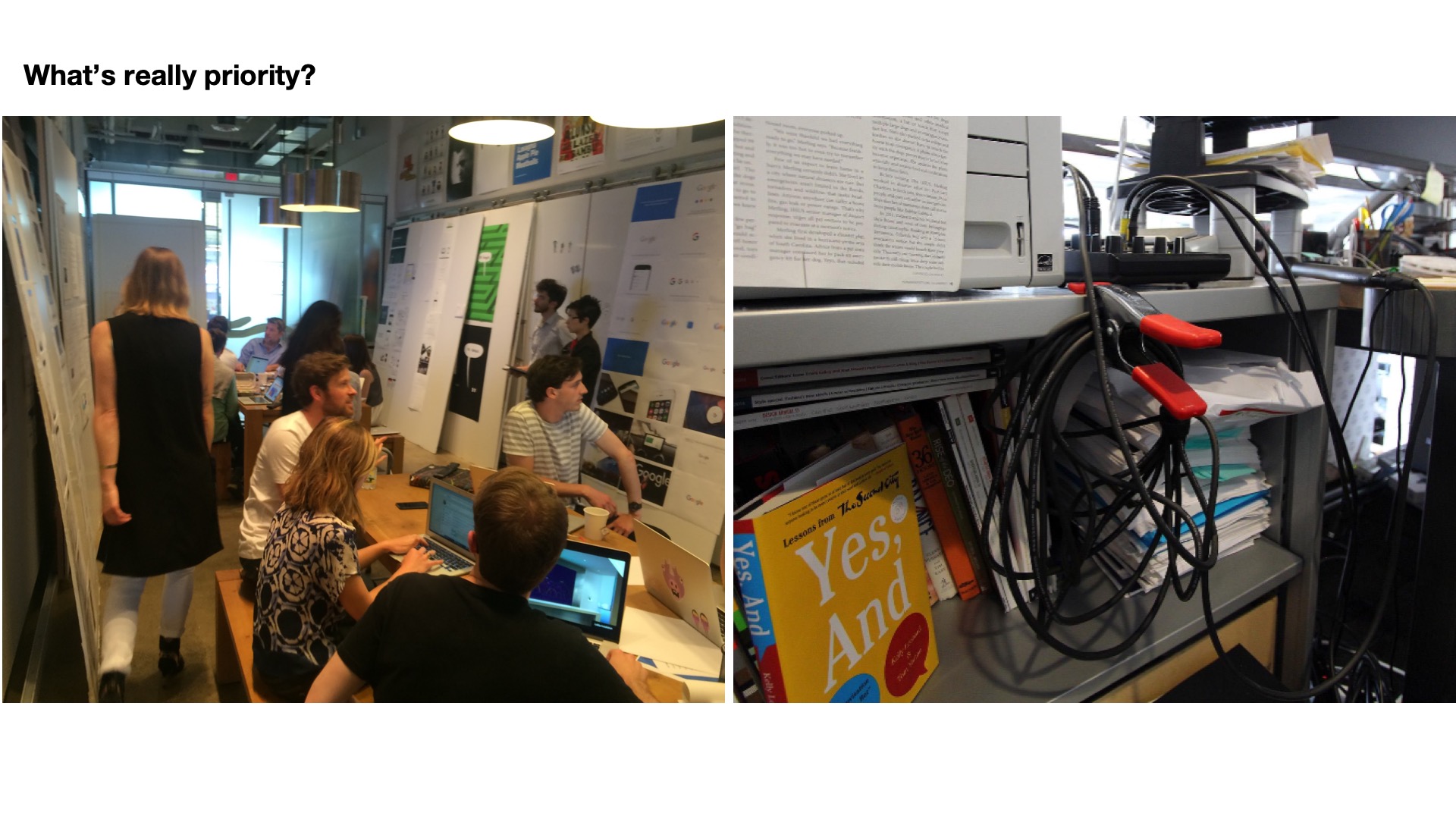
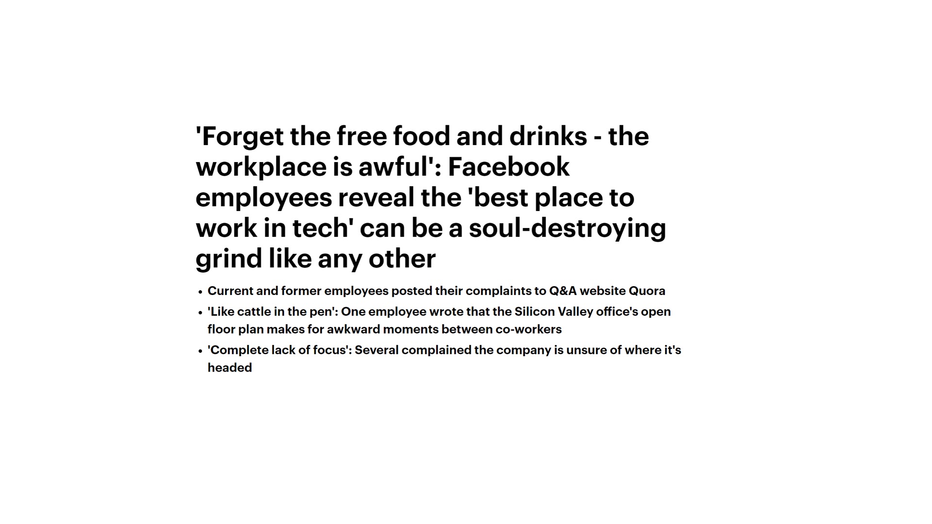
The second topic is in regards to agility teams are officers are working faster and faster in teams change and they come in and out. But what happens is that the actual work spaces are not accommodating these types of work styles or work requirements. And so even and this is I'll admit this is from the Daily Mail case. It's a bit of a rag magazine but paper but from a couple of years ago. But you know we've seen the most quotes like people feel like cattle working in some of these you know some of the most innovative technology companies that provide a lot of great amenities, great food, fitness classes, meditation programming, still have scooter rides, game rooms and even people still building slides for some reason, but really the reality within the office space and the actual work space is that they're not optimized for what's actually happened the type of work that’s being done.
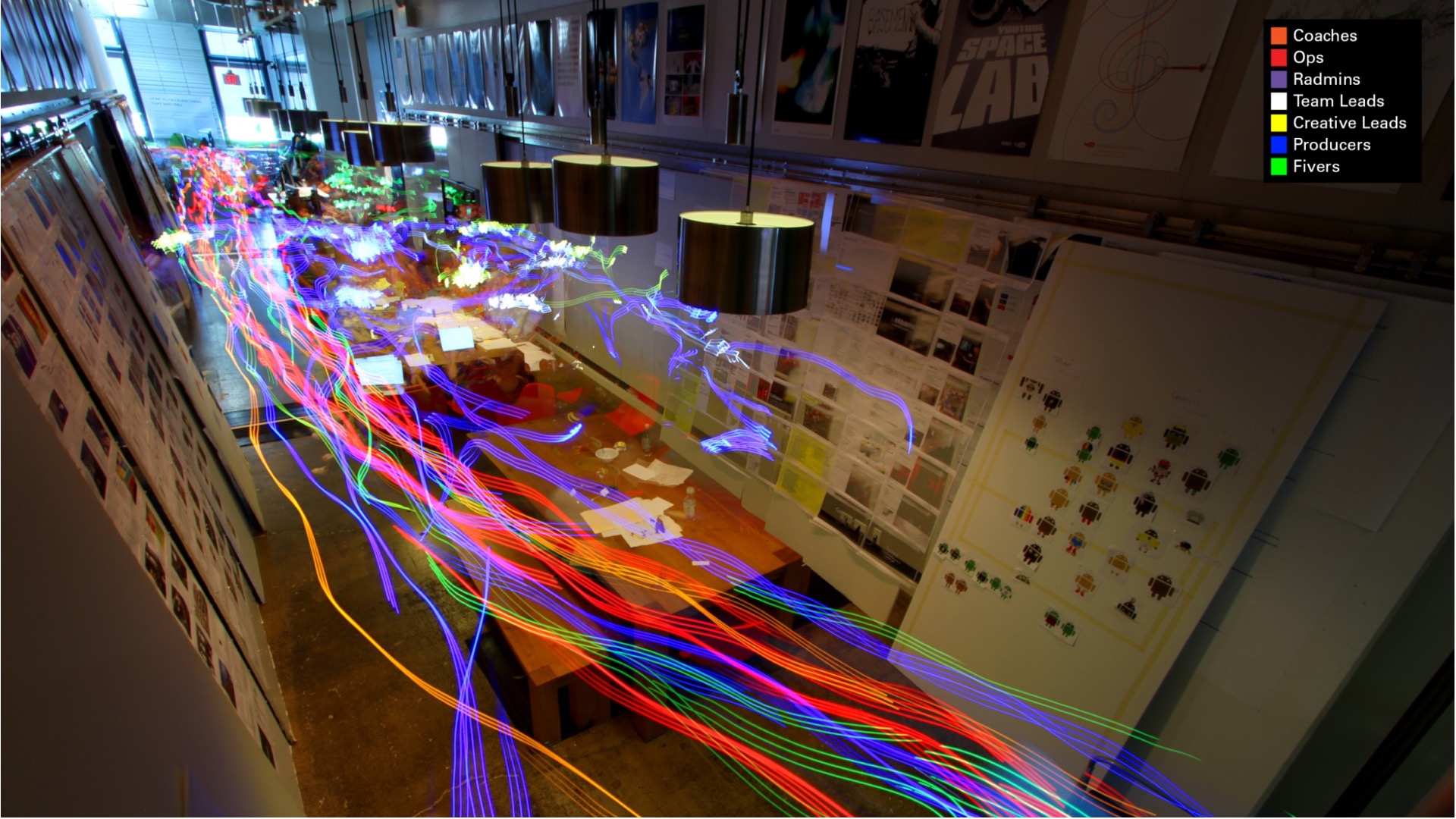
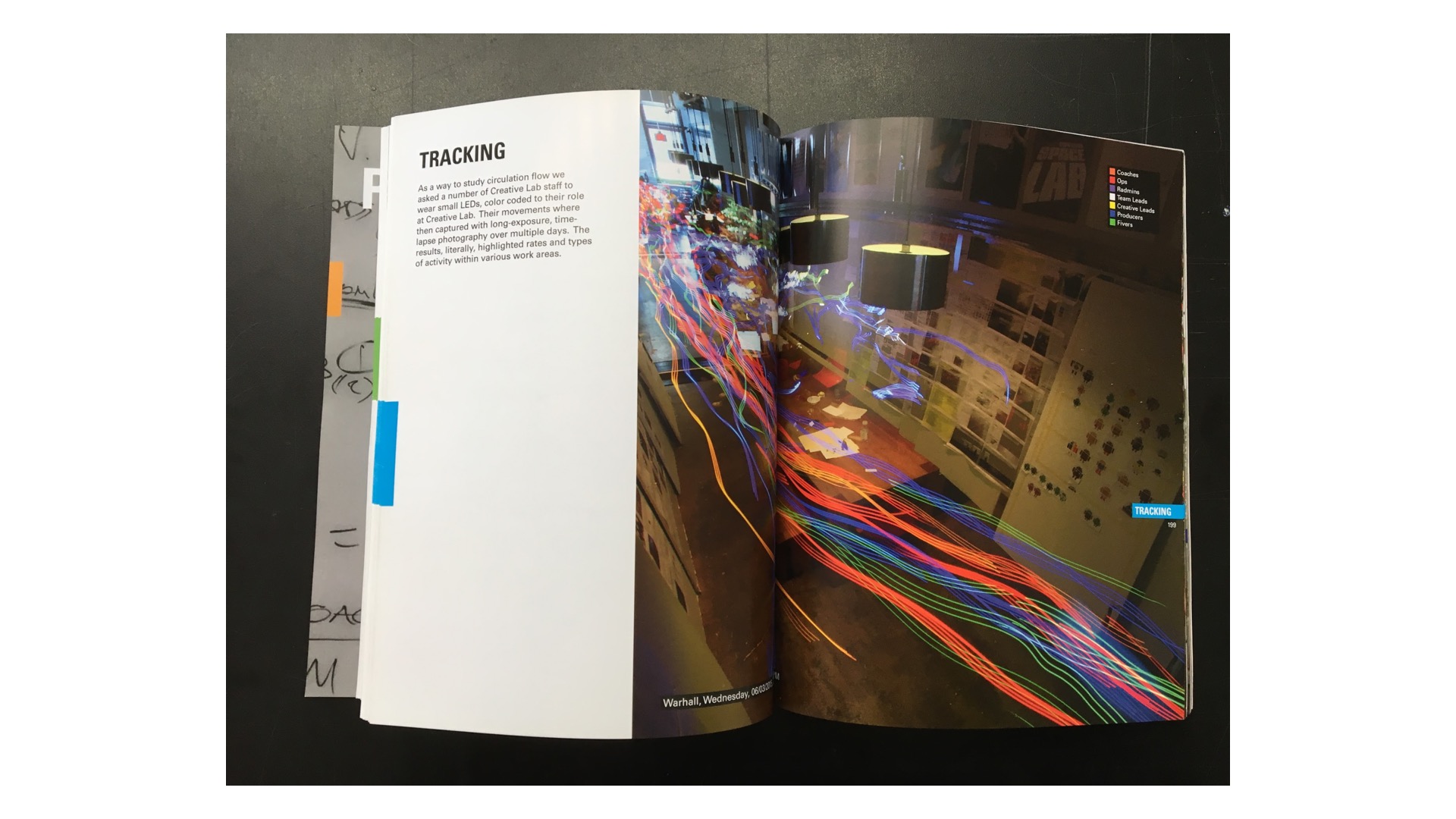
And so we get these quotes you know forget the free food and drinks the daily work hours, it feels like a grind. And so for this particular project we had a really rare opportunity to spend a few weeks embedded in the client's office to observe their functions and operations.
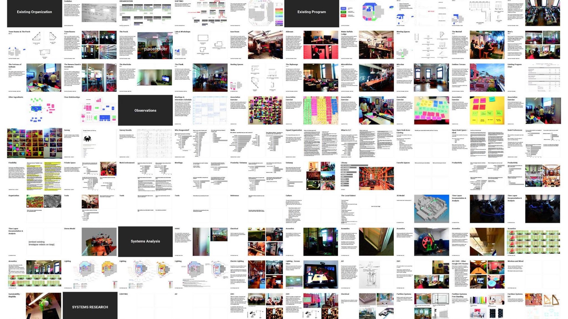
The result of it was this almost 300 page book full of interviews and surveys and discussions and workshops results as well as some suggestions about potential technological infrastructural and even programmatic approach to the future office. We've done all of this before starting any concept design and the result was a space that was very much about the infrastructure infrastructure that can allow the activities the working types the groups that are working there to change the space on their own as their work habits and work styles change with time and with influence of technology.
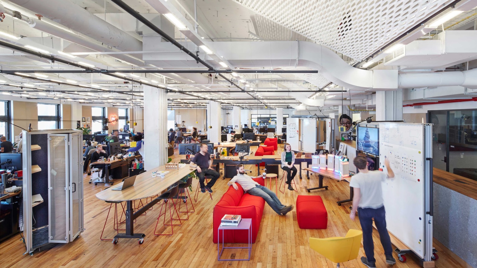
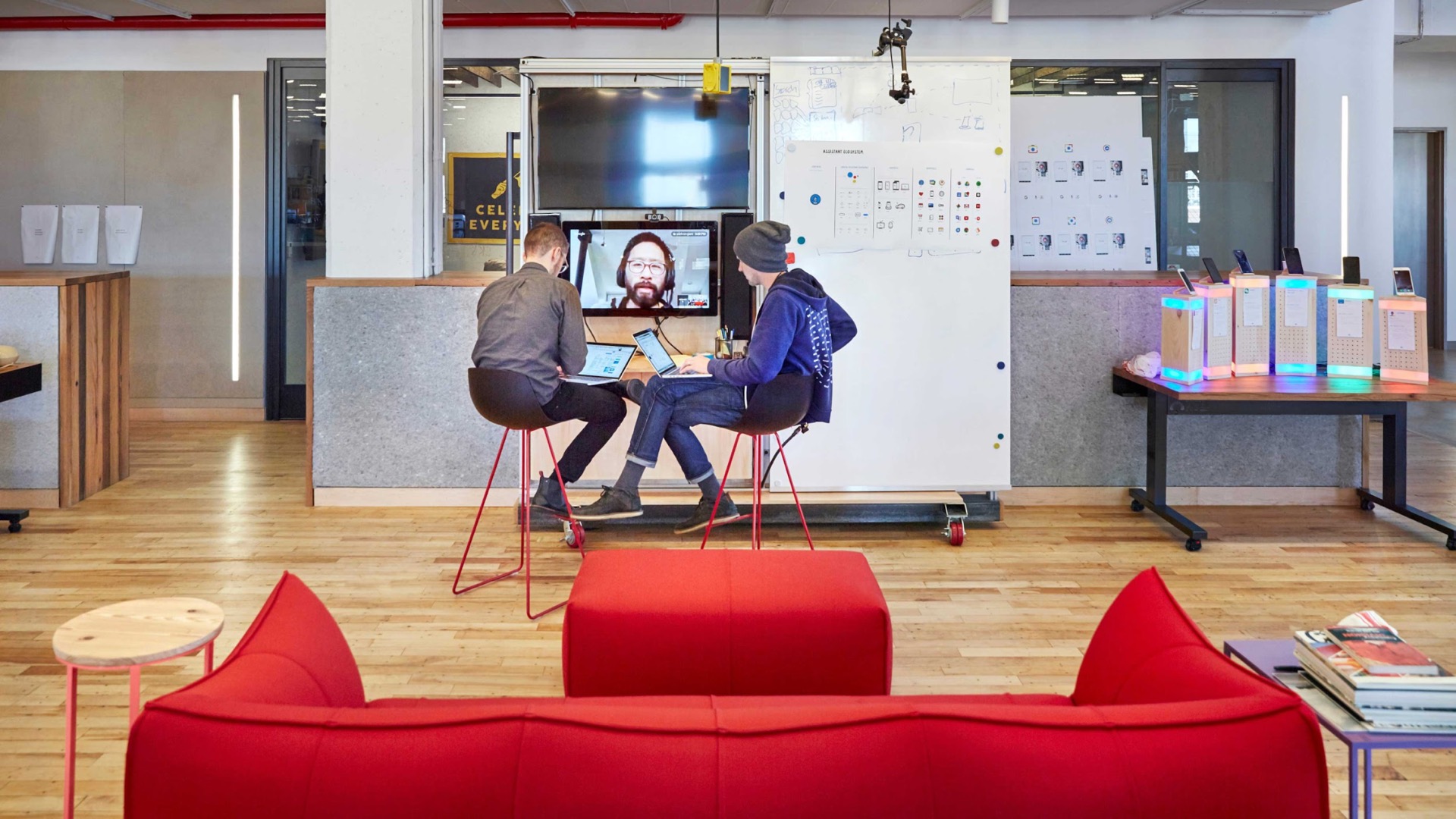
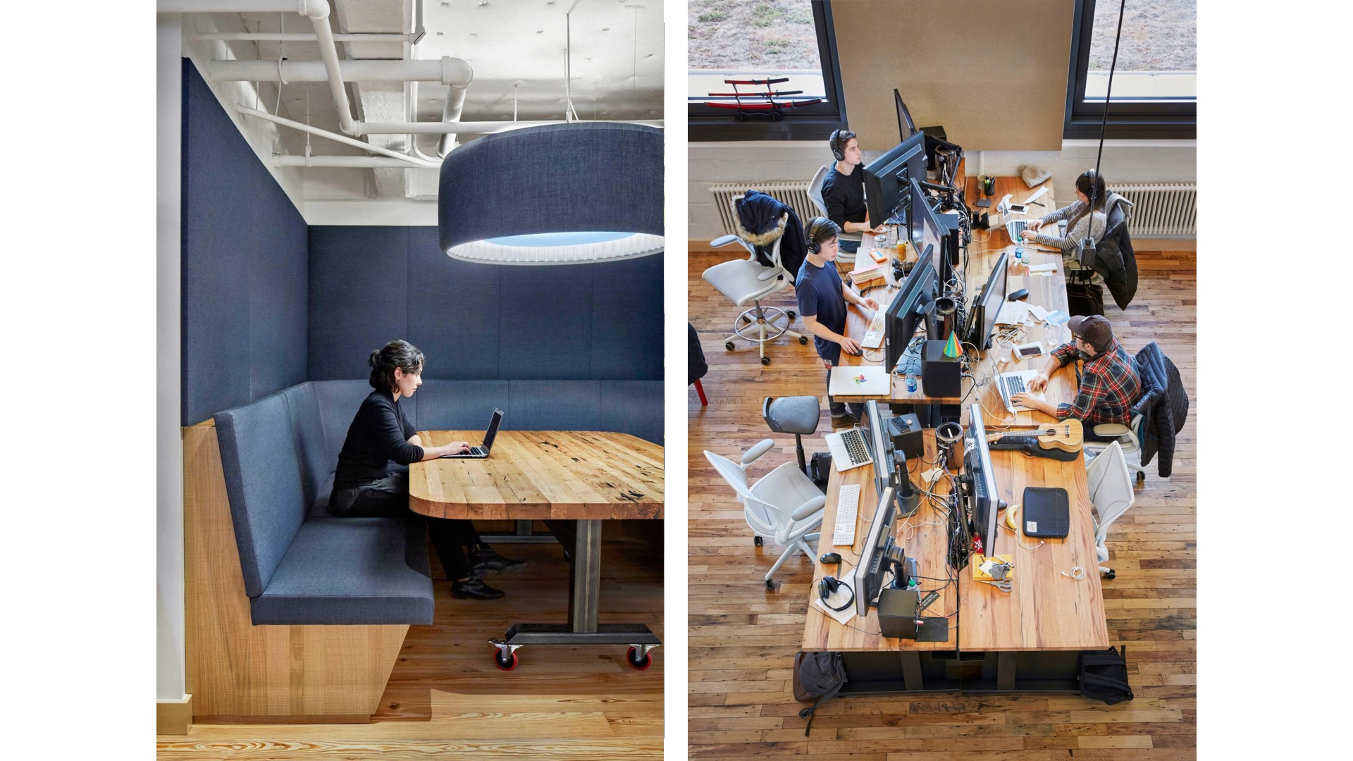
And so what we see here is a floor plate that pretty much everything that's on the floor is mobile whether it's on wheels or it's light enough to push around and most of your infrastructure is up in the ceiling datum. So starting with the kind of theatrical pipe grid that suspends the lighting system, the acoustical system as well as supplemental power drop downs and data drop downs but it also allow the team to for example one team in the space for a number I believe five or six weeks set up an area for a VR demonstration so that they will mount a number of equipment and sensors into this space and so the grid was allowing them to do this type of an experiment right in the middle of the work space, not having to leave their workstations.
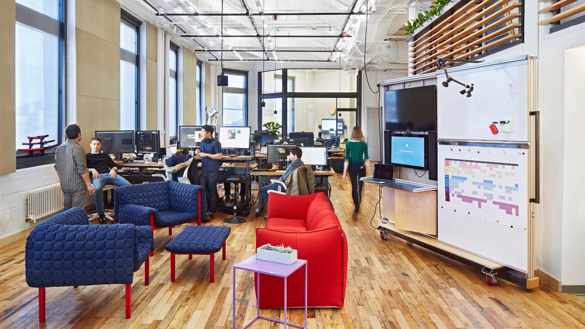
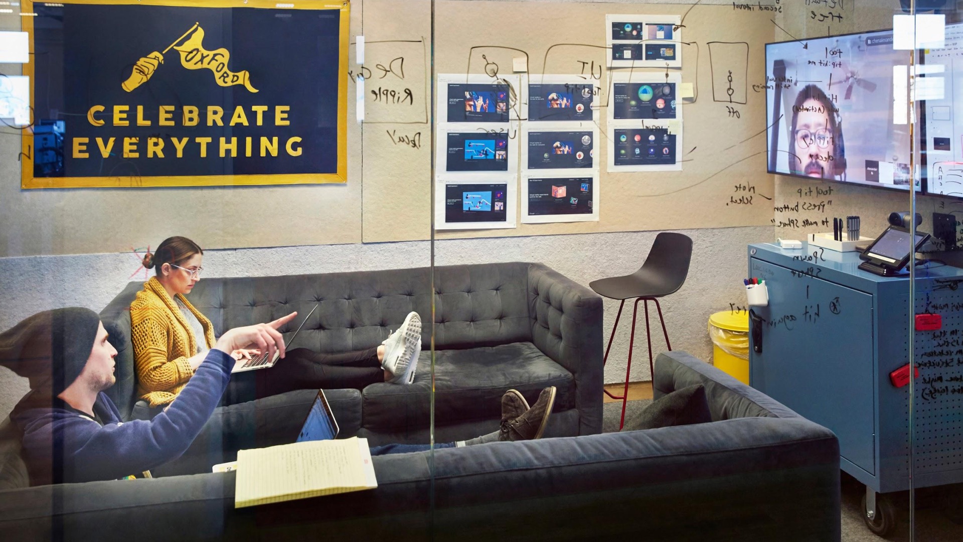
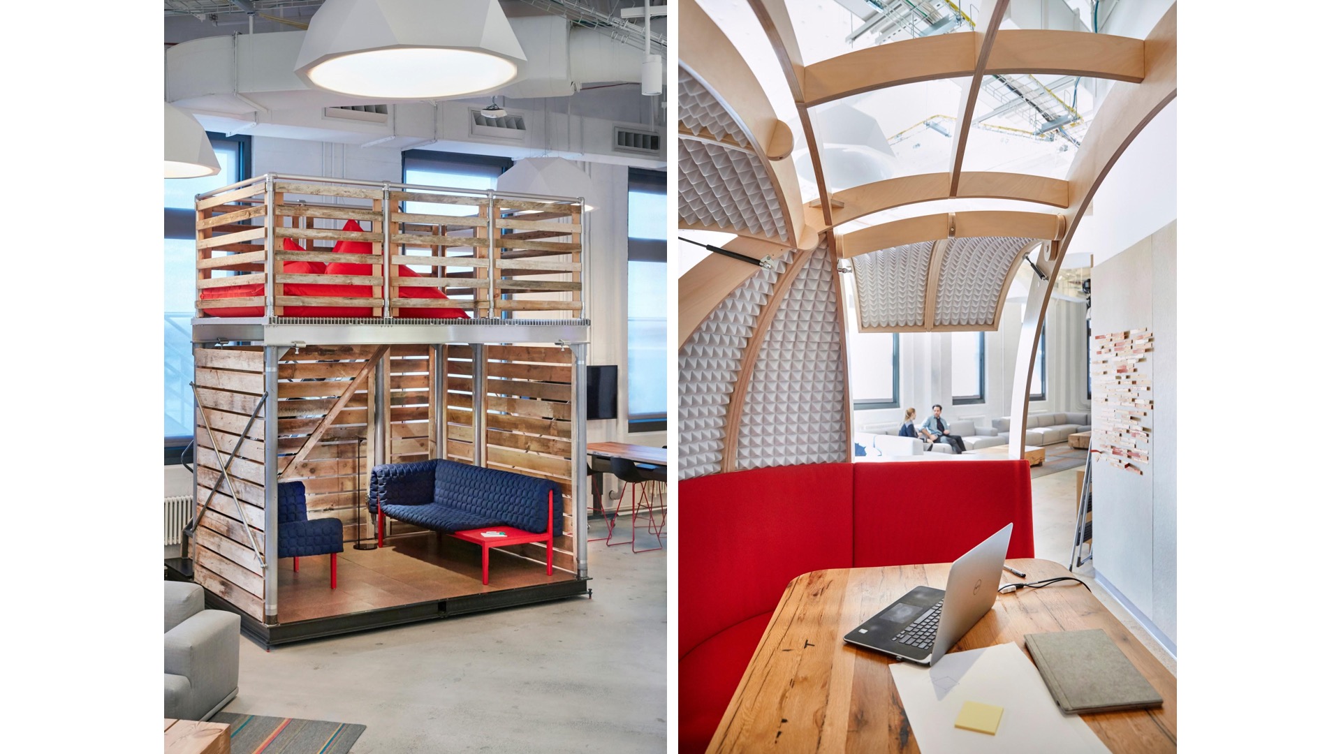
You know the other moves here is that placing soft furniture again right in the middle of of team spaces so people don't have to go far to find a lounge to catch a break, they can hop off their works doing hop on the couch. The other thing you see here is this first version of what we're calling a war wall. Really it's a mobile conference system that we were prototyping with this project. We've designed a second version of it for the next project for the same kind and we're starting to work on the third iteration of this. But really this allows you not to have to search for a conference room but hop on a call utilizing specific audio and video equipment that can focus the sound within a specific range of this wall and have your video calls as well as ideation pinup sessions, marker sessions right next to your desk. So this is what we're calling kind of team assets so things that the different teams can utilize within their work area not having to create additional rooms and spaces to support this type of step function.
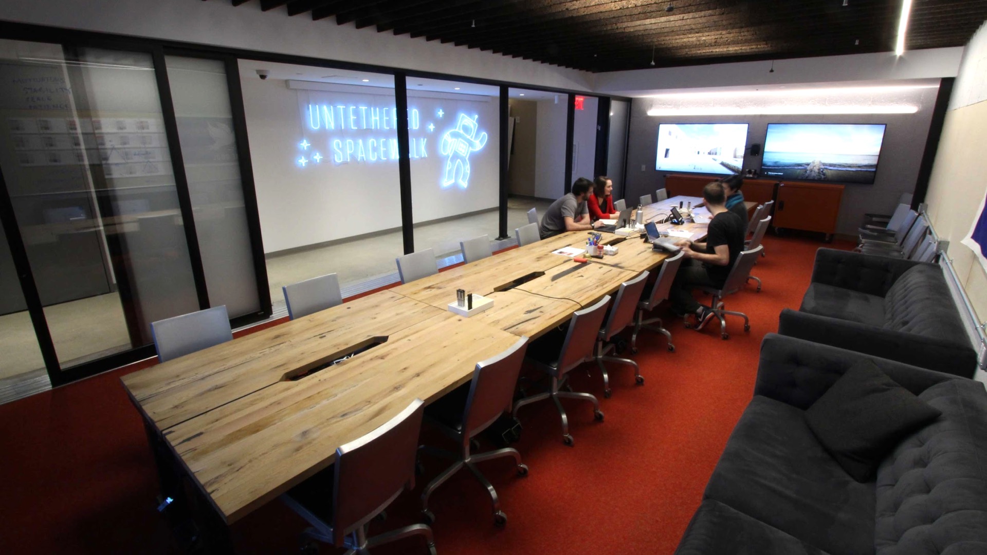
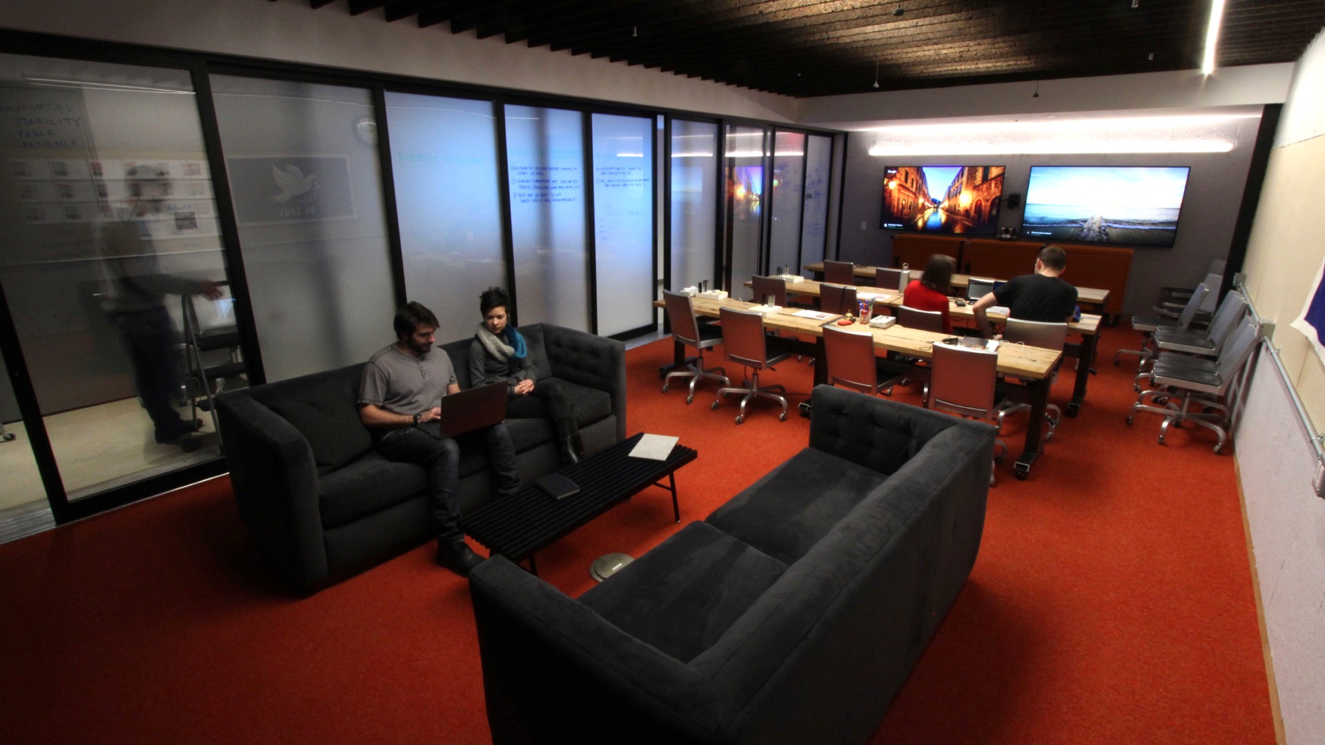
We rethought the conference room so not every conference table. In this case there's a few conference rooms with couches, the entire conferencing system is on wheels so you can be moved out so the change of the function of use the function of the room can be changed very quickly within within an hour or two. This is an example of a very large conference room that quickly everyone from the start knew wasn't going to get a lot of use because there was just no natural light. It was too dark it was too large and so idea of a flexible conferencing system allows you to rearrange your large table that will maybe get used once and every 3 months by 20 people into a classroom scenario or a classroom and lounge scenario was very appealing to the client here and very obviously provides a lot more functions out of this space.
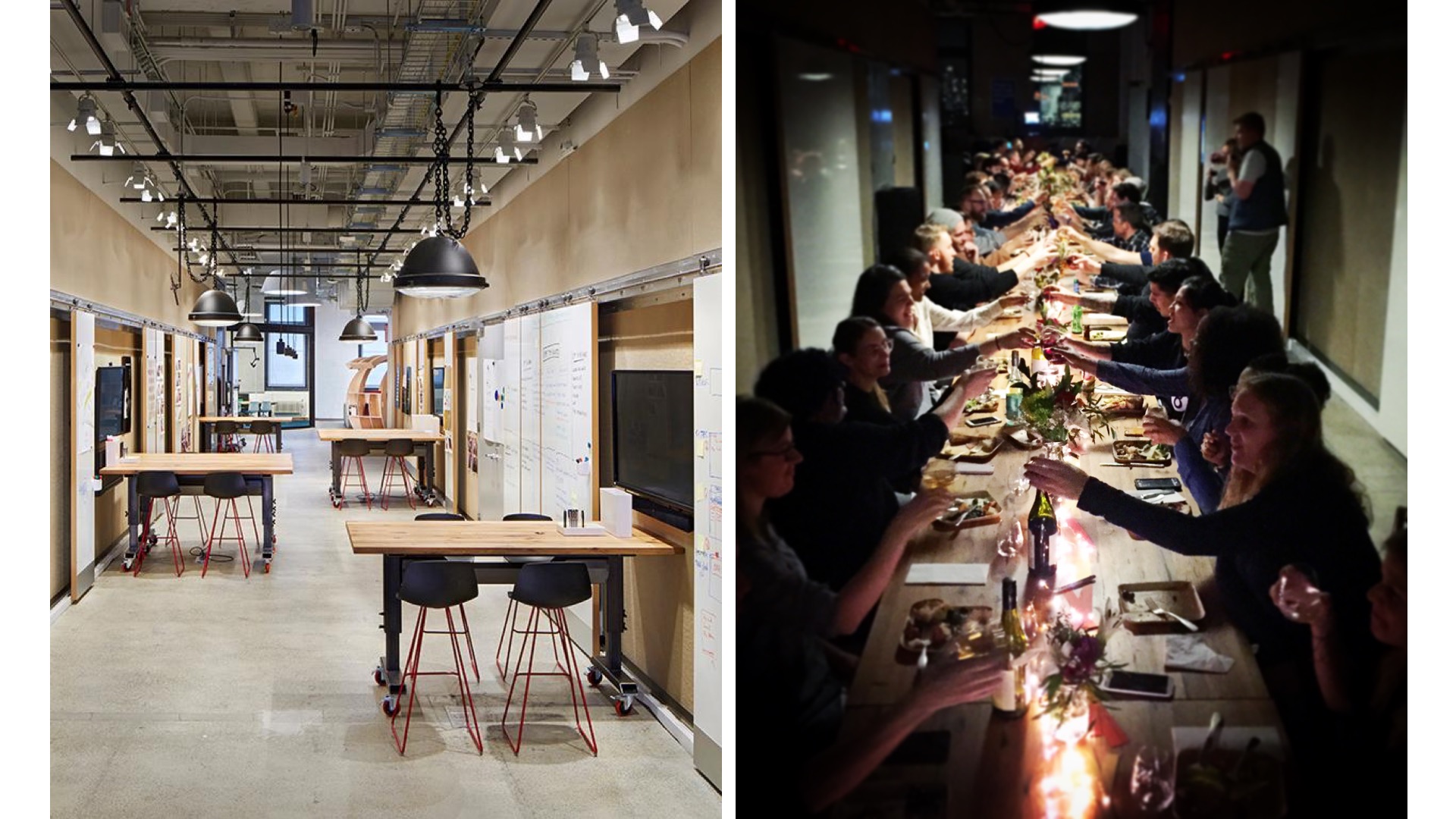
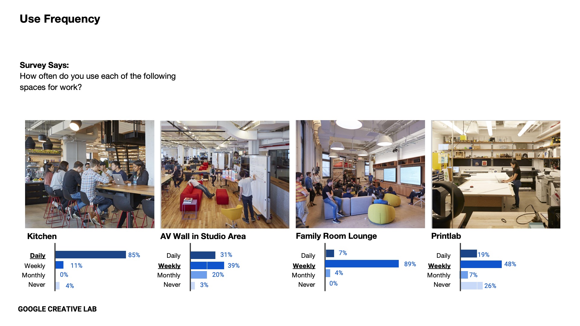
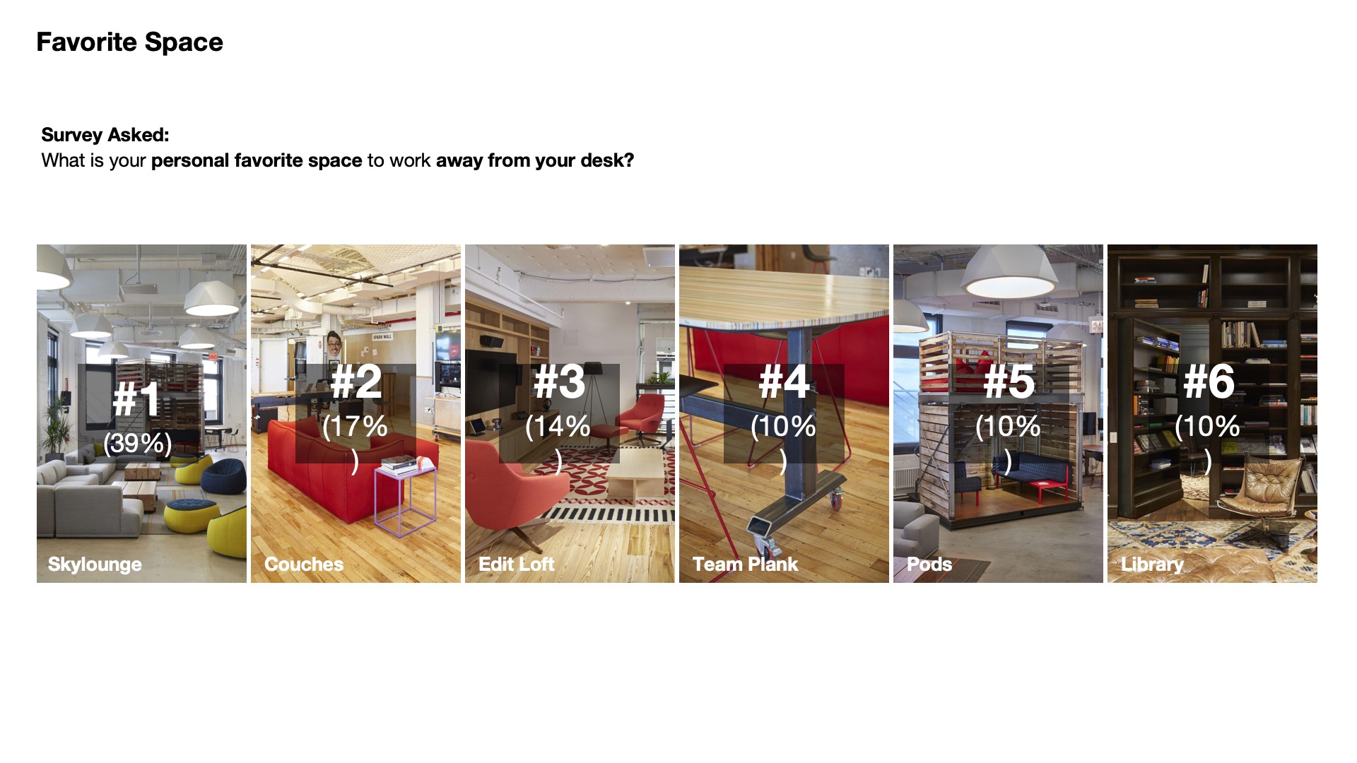
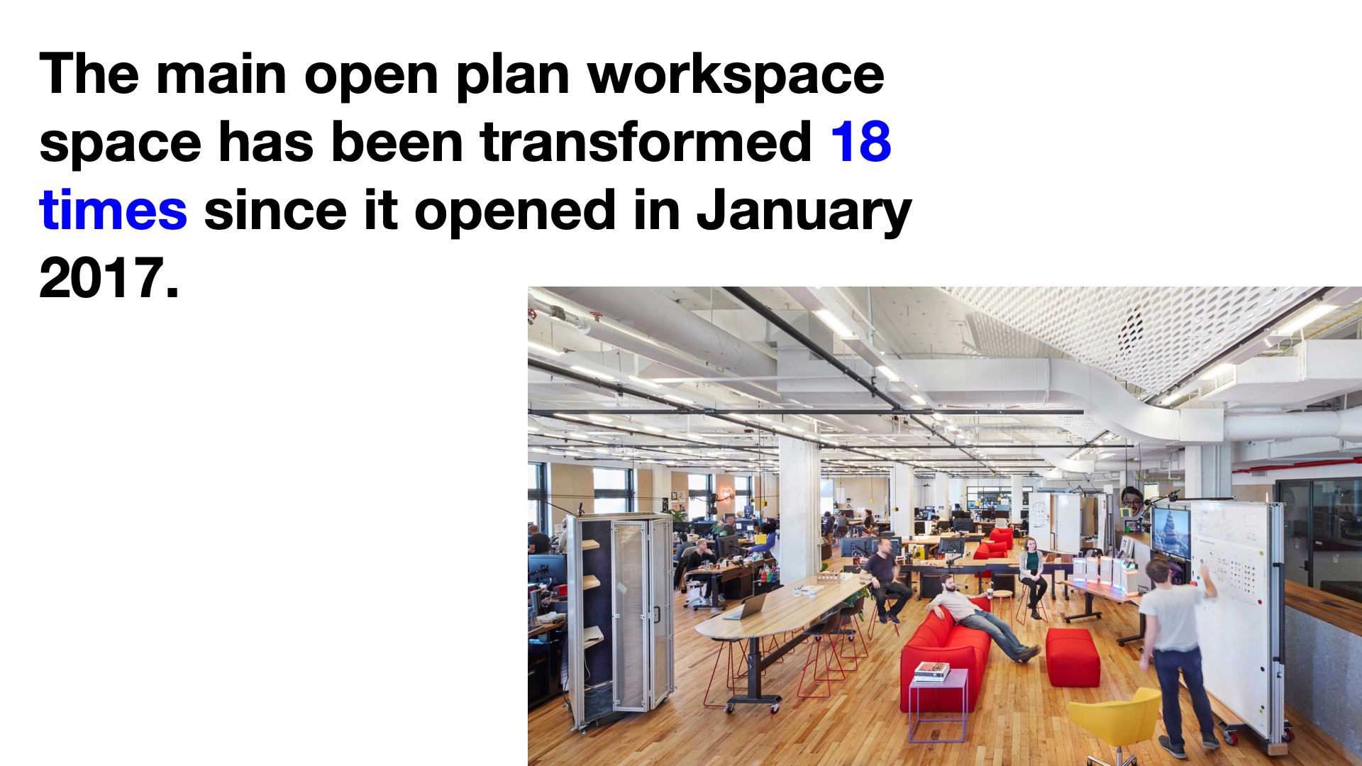
Another interesting space is really a circulation path that becomes this kind of informal pinup and discussion area so people can sit around tables pinup on the ball sliding partitions on the walls utilize the screens there but also the same tables which have height adjustability can rearrange for other types of activities and in this case this was a first Thanksgiving dinner after the project opened and so there's obviously there's this always a variety of space and this topic was brought up before. There are the kind of quiet getaway spaces and you're more kind of energetic collaborative spaces, workstations there's obviously other lounges that you can get away to to find more to retreat and quiet. We even designed these kind of mobile pods that can move around the floor plate to set up the smaller meeting areas are more appropriate for the size of the meeting, the type of meeting it is instead of going into a conference room. And we're lucky in this instance too to come back six months months after the project opened and do some post surveys to understand where we succeeded and when we fail and which spaces work in which spaces didn't and as people just reading this on this slide people are reading their most favorite spaces away from their desk. This is a very recent statistic that we found out we checked in six months after the project opened and they're like we've actually rearranged the main studio space, I think they said like four or five times, and we were just there a couple of weeks ago because we're working on other projects with the client. When we checked in with their space administrator and the track all of this, they tracked the track a lot of data, they said they actually transformed this space 18 times since opening in 2017. And this goes back to the idea that teams work fast need to change their how they're relating to each other with whom they're working where they're working et cetera. So this is really exciting and shocking and have to say for me to hear the other day.
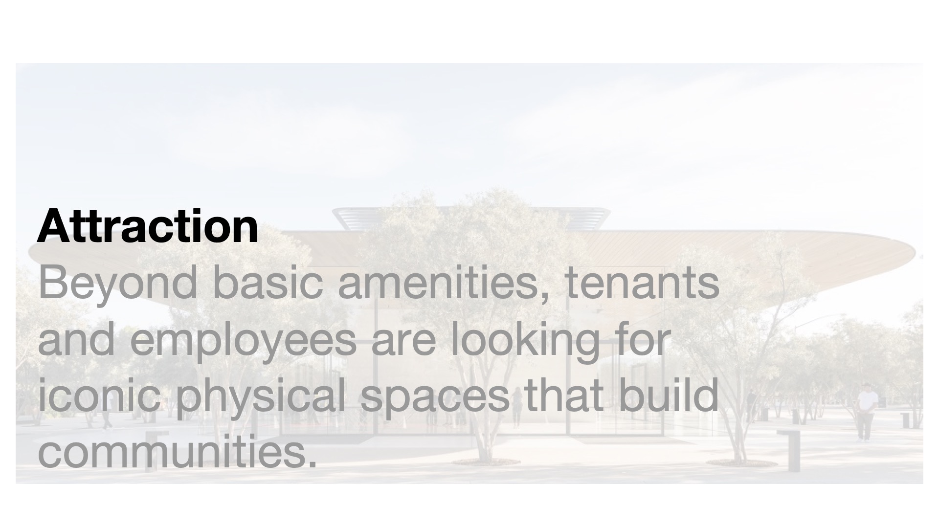
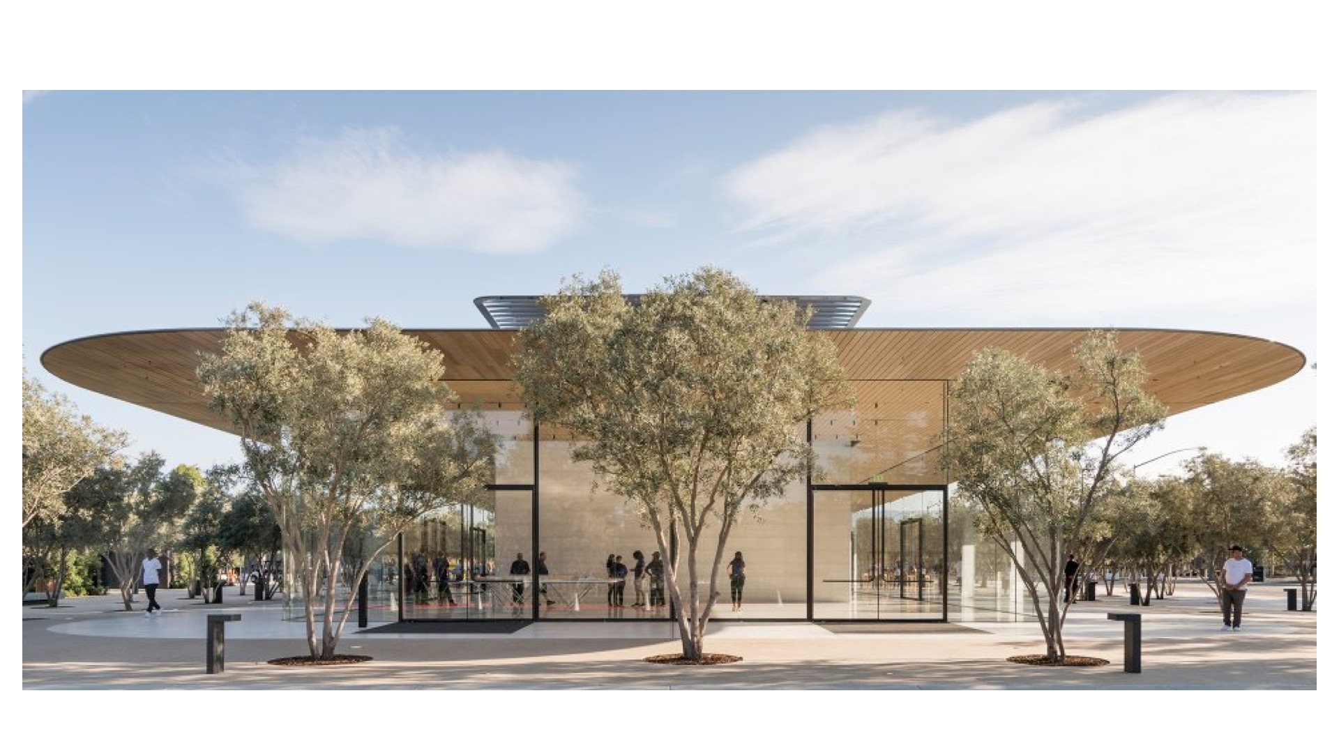
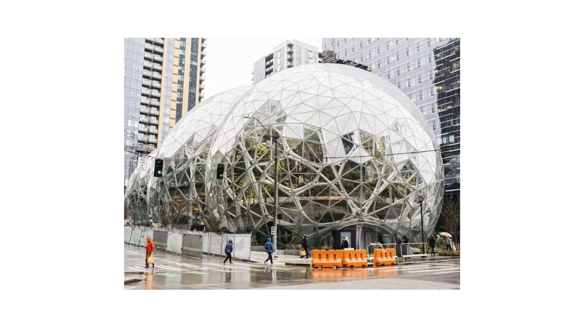
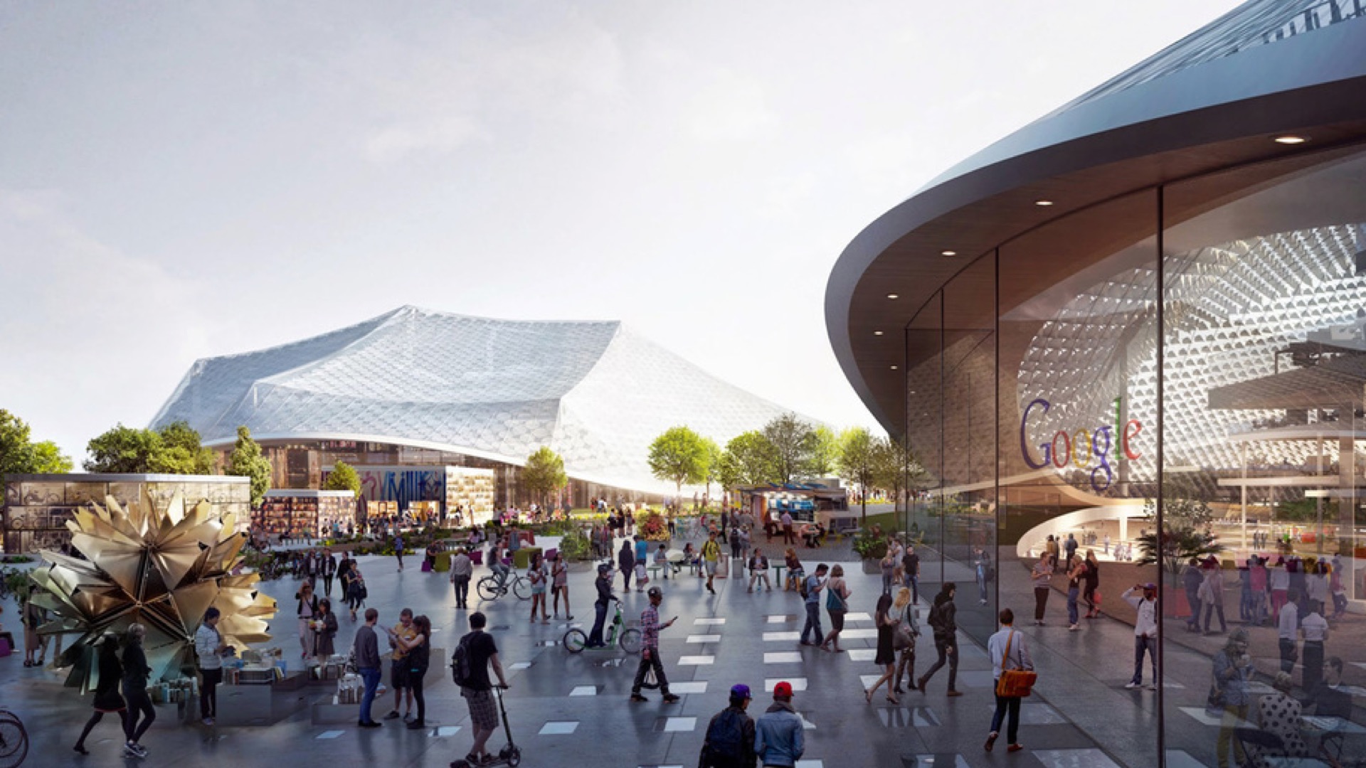
The last last topic is about attraction and this is really about us realizing that there's a real need out there for great places not just spaces, but places that bring together people and communities. Now we've seen a handful of these kind of a large communal slash in this case retail spaces there are visitors centers for various large tech companies out there. The best example because there's still kind of orienting too towards the consumer to the public but they're really not thinking about the employees. So that kind of branding flagship projects this project is really interesting because I mean at the scale that Google is building they have to interact interact with public with public spaces. So you know although this is a security nightmare but there is actually there campuses are now being bisected by public circulation routes.
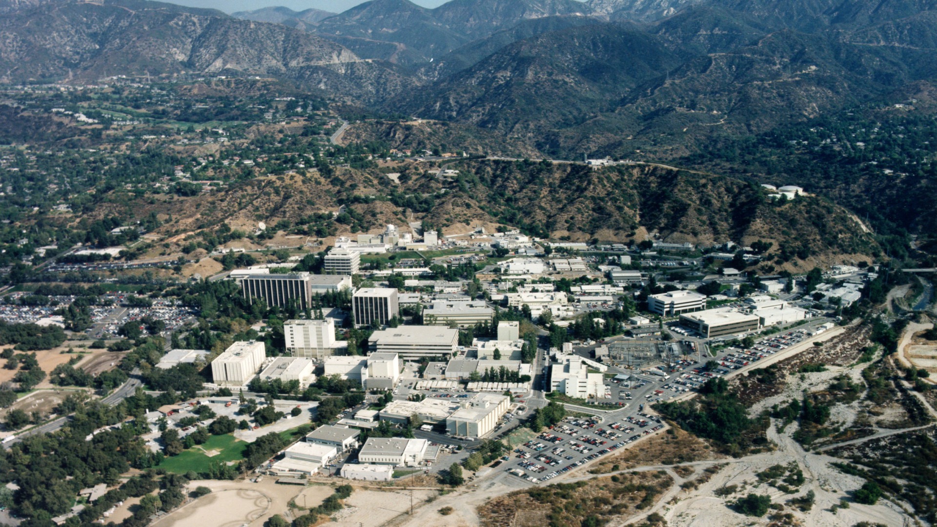
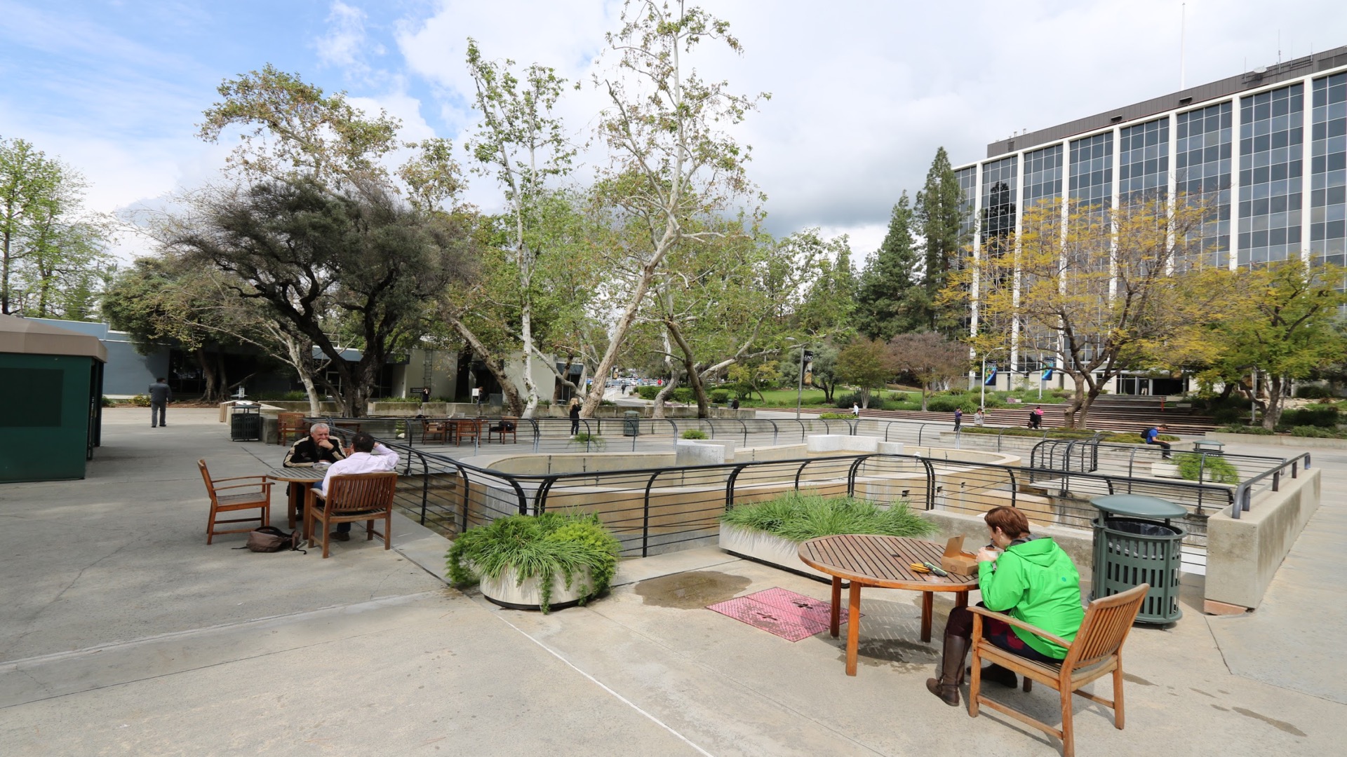
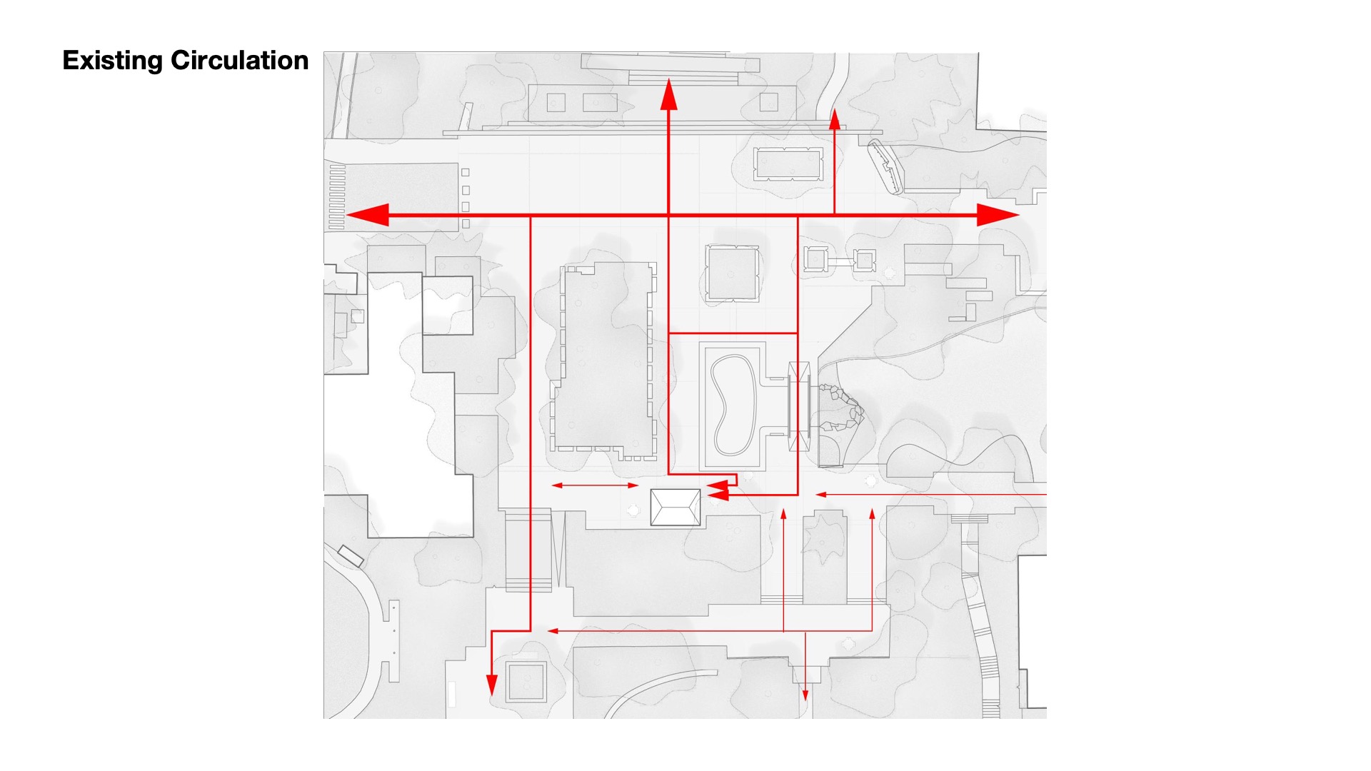
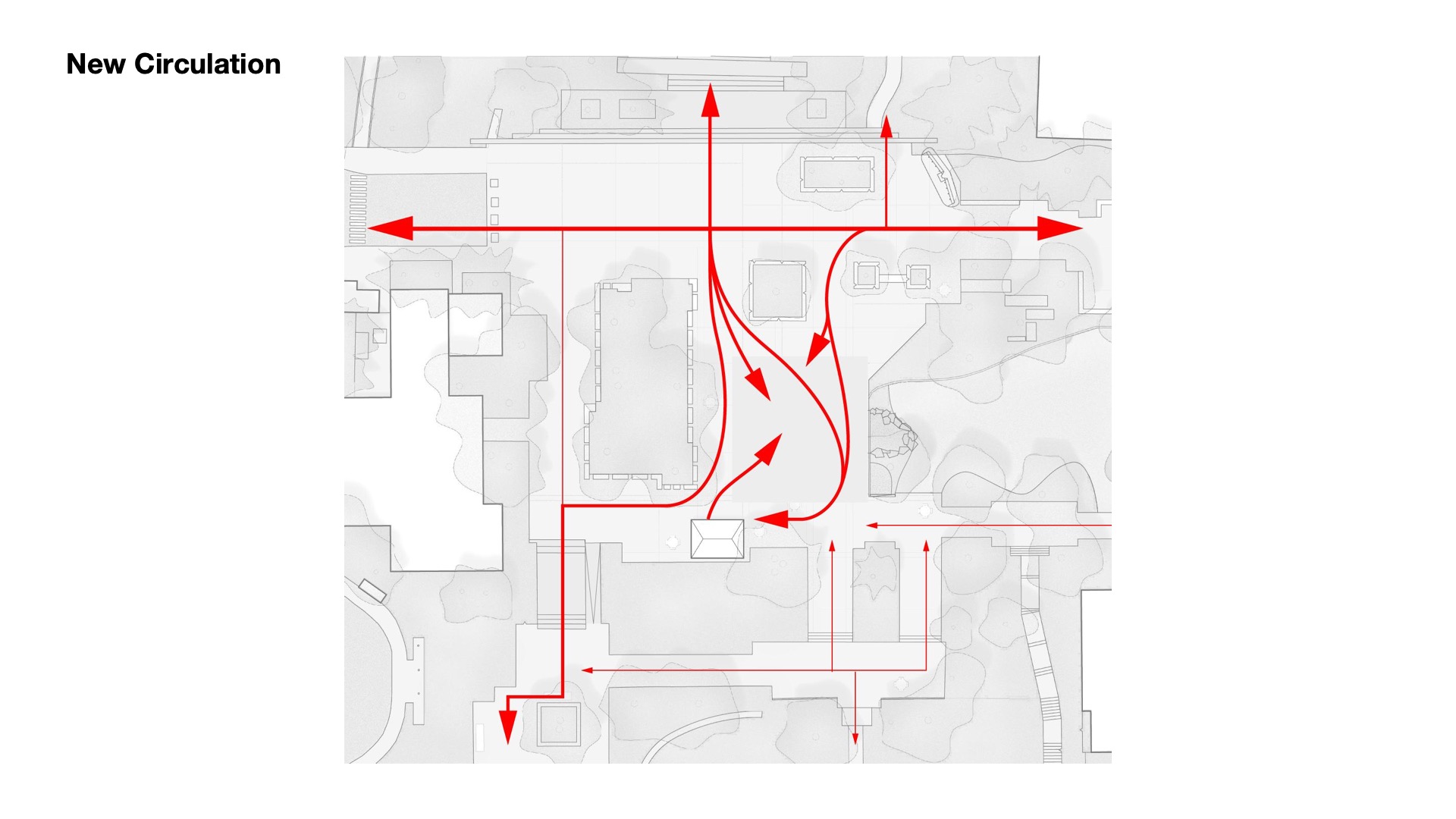
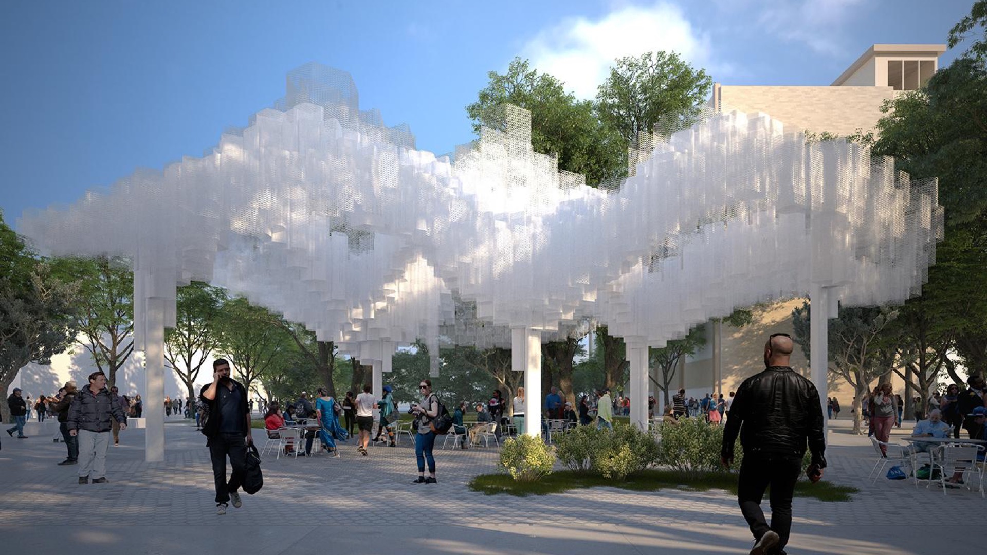
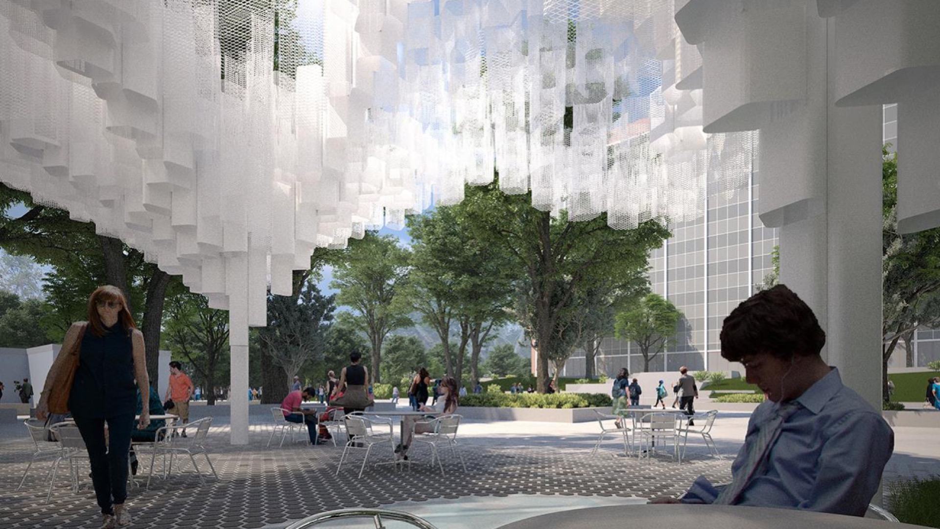
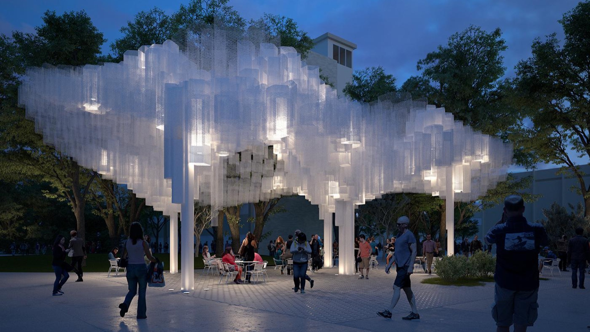
Not too far from that project we're working on a much smaller public space project for nonetheless an exciting company. This is NASA's JPL division, the Jet Propulsion Laboratory, and their campus was designed in the 50s and 60s and the original design had this the central plaza of this campus had this grand fountain that has been decommissioned the last 10 years or so because of the drought but because it also doesn't really function perform any other function. And so we were asked to rethink this public clause of this public space and create something that supports work outdoors in the hot L.A. sun, provides a communal space but also provide something that's iconic and that's something that represents the mission of JPL. And so instead of being this kind of barrier in the center that kind of bean shaped in the middle is the current fountain, our scheme was really to make that a place of congregation, of community. In the place of the fountain, there's this new pavilion about 5000 square feet. It provides shade for the workers to come out whether it's to have a private call. There's actually a small water feature just to create some audible noise to create a little bit more audible privacy. It's a structure of material and structural approach that we feel like is innovative and interesting and ultimately iconic. The space also provides lighting for nighttime and access to fast Wi-Fi as well as outlets to plug in your technology. So this concludes my talk thank you very much.

